Concept to Shop Floor Timeline of making a product:
Concept
Brief
Research
Decide manufacturing method
Complete your products design
Create Prototype
Test Prototype
Manufacture & Package
Pitch & sell the product
Product:
Skateboard Deck in Shrink Wrap
Price:
Costs about £10-£15 to make each, price varies with size of batch, £50 Retail, Discount if over certain amount is spent
Promotion:
The design on it could be done by an artist, Contains special technology, Show professional skaters riding it, advertise in skateboarding magazines, online (adverts, promotional videos)
Place:
Skate shops, Online, Trendy high street shops Getting the price of a product is incredibly important when selling your own product, as you need to get the highest amount of profits with as little loss as possible. One example to consider is the law of diminishing returns, which refers to the point at which the level of profits is less than the amount of money/energy invested. This point needs to be identified accurately and acted on quickly.
Throughout my first six weeks on this course, I have learnt a lot and started to develop many new skills in a range of areas.
Firstly, in Moving Image and Media Theory I have developed my knowledge about film and the history of film. I've discovered how films have changed over time and how different shots connote different moods and feelings to an audience. I've found out how sound helps to tell a story and make it more effective, and the process of how it's done in the real world, which I didn't know before. Through this I learnt about foley artists and how to use a sound recorder to get my own sounds for my films, and how to edit them accordingly. I've also learnt how to effectively use Premiere Pro (which I had some knowledge of before) so that it backs up my project as I work, and lays out my footage in an organised and effective manner.
In my Audio lessons with Tom Grey I have learnt about audio and sound in more detail. He helped us further understand about sound in film, and how to use Premiere with sound design and music, so that the sound is mastered and doesn't clip. He also taught us about making photomations, and how to edit them in Premiere by importing photographs in a group called an Image Sequence.
Publishing with Ty has helped me learn how to be more efficient with photoshop, as well as develop my knowledge about graphic design and film posters. I already had basic knowledge of photoshop before these lessons, however he let us experiment with the program and discover new things individually. He also taught us a range of keyboard shortcuts and techniques to make us more efficient with the program. In these lessons I've produced some of my own film posters that I'm proud of, and gained some useful knowledge and skills which will be helpful later in the year.
Film Poster Mashup made
in publishing (Design 1)
Film Poster Mashup made in publishing (Design 2)
Sprited Away Poster (Made in Publishing)
Final Design of Spirited Away poster
Lastly, Interactive lessons with Steve Spicer have been really useful in helping me develop my knowledge in design and how I look at pieces of work me or others have made. In these lessons I've learnt a lot about very important parts of Media such as colour, text and design. Steve taught us about colour theory and colour harmony, typography and connotations of typefaces which are very useful to know about, and have helped me in other lessons when designing things. I also learnt the basics of Adobe Illustrator which is a complicated program, made simple to understand in these lessons. Using it I have made infographics as well as gained knowledge on how to use it for making posters and 3d graphics.
Colour Wheel made in Interactive
Image made in Interactive showing different parts of a typeface
Overall I think that in this first six weeks I have learnt a lot about programs and theory which will be very helpful as this course goes on, and now I feel a lot more confident approaching tasks with this knowledge. I still have things to improve on however, one is being more effective at planning and putting more time into planning before getting into a task. Another improvement I could make to help my learning is to spend time doing independent research and work (i.e. outside of college) and giving evidence of this. In the next term and half term holiday I will definitely try to act on these improvements, be it watching a few films mindfully, reading a book or getting outside with my camera and experimenting with it.
This blog shows all examples of all of the skills I have listed, as well as the video below, which shows some examples of skills I have developed:
Over the past six weeks I have improved and learnt a lot. When we first started I already had some basic knowledge of photoshop and had used it before. But by being able to play around with the program and try using things in it that I hadn't used before, I learnt about new things I could do in it. One of these things were layer masks and another skill I learned was the content aware fill. This was very useful and I used it in my photomation that I had to make for another lesson. My teacher also showed the class hotkeys and shortcuts in photoshop so now I can use the program a lot quicker and more efficiently as I don't have to click on every tool to use it. I also learnt a lot about posters like the common conventions of a poster and what makes a poster look good or bad, despite thinking that I knew about film posters already.
Next time I would spend more time perfecting things I make in photoshop and I'd spend more time planning my projects and researching photoshop as I spent a lot of time sitting looking at photoshop not knowing where to start. Overall however I have learnt a fair amount and produced some images which I'm proud of.
Here are the final two posters that I made, which are a mashup of films Léon: The Professional (Léon) and E.T. For the purpose of this task I will be analysing the red one, which I made secondly, however it is my favourite.
I think that at first glance it looks like a realistic and professional film poster, and the red and black colour scheme help it to stand out and connote what the film could feature. It contains a tagline at the top, a common convention of film posters which is comedic and suggests themes of the film. It also shows a very large image of the main character to suggest to the viewer who is going to feature in the film. Because it is so large, you can see imperfections in the poster which are something I can improve on. The glasses and beanie that ET is wearing look scruffy which make the poster look a bit more homemade and unprofessional, as they were drawn with a marquee tool on photoshop. Another thing that the poster could improve of is the blank background, as ET is on a gradient but nothing else so the poster looks bland. This is what others suggested for improvement too, and one peer said that I could add some buildings in the background. One other good thing about the poster is the production credits which I added myself, which make the poster look legitimate and add some life to the poster.
To make this poster I firstly took into account that I was working at a very large scale, so I downloaded a picture of ET and vectorised it into a 6 colour shape using Illustrator by tracing it. This way I could have a picture of ET that could be scaled up to a very large size, and that was my own. I dragged the picture into photoshop and applied a gradient map to it that was red and black, to fit with the colour scheme.
After this I used the text tool to type out the title, and the character window to adjust it accordingly. The font I chose to use for the title was Akzidenz-Grotesk Pro Super as it was bold and stood out. I adjusted the typeface slightly by increasing the tracking, stretching the type to 120% wide, and making it red. I could do all of this in the character window.
After this I added some other text to the poster. I wanted the tagline at the top to look appealing so I looked for a font that looked good in lower and upper case. In the end I used Helvetica Neue Condensed Bold. The white tagline really stands out and contrasts against the red/black so that the audience see it. I also added production credits to make the poster look professional and realistic as this is something I left out in my first poster design I did at the start of my publishing lessons. I looked up what font is used for production credits, but the college computers didn't have it so I looked for a similar font. I ended up using Akzidenz-Grotesk Pro Light Condensed and again adjusted its tracking and size in the character window. It has a subscript button which was helpful in making certain words small.
Subscript Button
To finish off the production credits, I found some logos online to add to the bottom, such as the Dolby Logo, Rating, and Production Company Logo. The logos I found online were transparent however they were black so I inverted them to make them white. After this, I used the polygonal lasso tool to draw glasses and a hat on ET, by making a selection and using the paint bucket to fill the selection. I also added different coloured accents to the shapes I drew in the same way.
After this, I found a splattered brush that I could use to paint a beard onto ET to make it look like Leon. I painted it in three different shades of red to give it some definition.
Lastly, I added a black vignette to the poster to put behind the title. I did this by using the Rectangle Tool to make a black rectangle, then I used the Elliptical Marquee tool with a very large feather on it to cut half an oval out of the black shape. The finished poster looks good in my opinion and I think that by using a colour scheme it looks really effective.
For this short video my group used Oscar's hair and beard to our advantage, making a video featuring Jesus. I used a range of shot types to connote different things when shooting this video, which incorporated everything we'd been learning about film and sound.
Firstly, it opens with the sound of someone urinating which leads the viewer to wonder where the sound is coming from and who is creating it. Then the first shot is shown (A long shot) and you're introduced to James, which matches the sound with the visuals. The second shot is a close up of James face, which firstly shows the character in more detail and secondly shows his shocked emotion, leading the viewer to believe he can see something. The third shot is another close up, which keeps the level of intimacy and is a point of view shot because it's what James can see. After this the dream sequence starts, showing inside James's head. It uses some clips shot on a black screen, and one shot of James lying on the floor, with the camera looking down at him. I chose this shot because isolates James as he contrasts with the light floor.
When James is waking up from the dream, I chose to use a long shot to establish the new location and the figure stood behind James. Because it's so wide, it also looks dramatic and helps to build the dramatic tension. To further build the tension, I included a buildup sound effect. We also chose to use a stabiliser in the shot that moves towards Oscar, so that it was smooth and looked intense and cinematic. The last shot shows a close up of James's confused face for comedic effect.
Overall, I think that this video is fairly good, however if we had more time to film and plan it then it would be more effective. I also used audio from the camera footage as dialogue at the end, which should have been recorded separately. What I think went well were the shot types I chose to use and how the tension changes throughout the video.
There are many ways that colours can compliment and work with each other, each one has a different
name and rule that it follows.
Complementary
Complementary colour schemes are two colours that are opposite each other on the colour wheel. They give a lot of contrast but work well together in most circumstances, if the saturation of the colours are at their fullest.
Here complementary colours have been used and a high amount of contrast
is created. This makes the piece stand out a lot.
Analogous
Analogous Colors are groups of three colours that are next to each other on the colour wheel, with one being the dominant colour. They look good together because of how close they are on the colour wheel and are balanced well.
Triad
Similar to analogous colours, a Triad of colours are three colours that are evenly spaced around the colour wheel. They are balanced, but contrast a lot so stand out a fair bit.
Here we can see that the Burger King logo
has used a triadic colour scheme, which
gives it it's vibrant appearance.
Square
A square colour scheme takes 4 colours that are evenly spaced around the colour wheel. It's similar to a triad but with one colour added, so therefore it will produce quite vibrant results and will work well with bright colours.
Split Complementary
Split complementary colours are similar to complimentary however it takes the colour opposite it and uses each colour which is beside that.
The Firefox logo uses a split complementary colour scheme of blue, yellow and orange.
Tetradic
A Tetradic colour scheme is made by drawing out a rectangle on the colour wheel. It gives four colours, 2 each which complement each other.
The word 'Gamut' simply means a complete range or scope of something. However when colour is concerned a gamut means a range of colours available on a certain device or platform. For example, a computer or tv screen displays colours by mixing RGB light, so the gamut is fairly large (as shown by the diagram below). A print based piece such as a newspaper or magazine uses CYMK mixing to display colour, and therefore the gamut is smaller. A gamut is useful if you want to preview how something is going to look when printed, as it can show the range of colours available on the device being used.
Colours in the 1960's were very bright and psychedelic because it was a decade of change and freedom. Some examples of the trending colour schemes are Andy Warhol's pop art which used very vibrant colours, The Beatles's Yellow Submarine Film, and the fashion of teenagers and young adults at the time.
These colour trends were heavily influenced by the hippy drug culture at the time, as the use and availability of LSD and Marijuana increased (hence the vibrant psychedelic colours). Additionally music figures like The Beatles and Elvis Presley influenced colour trends, as well as the desire for freedom and change as the war was over and people were happy and relaxed.
As the 60s passed the colour trends changed again with culture, and at this point vibrant, bright colours became less popular changing to calm, more sophisticated earthy solid colours like beiges and browns. The country was recovering from another war, so peace and calm were reflected in these warm earthy tones.
Nowadays, the trending colours that have stood out to me are golds and yellows which were incredibly popular during the summer, and pastel colours such as baby pink and light blue. Here is a list of the top 10 colours of spring 2016 I found.
How Many Colours in a GIF?
-256
What is the Colour Mode of Photoshop?
Photoshop has a range of colour modes that can be selected, these are:
Bitmap, Grayscale, Duotone, Indexed Color, RGB Color, CMYK Color, LabColor, or Multichannel
I decided to analyse this scene in Pulp Fiction, which is where Jules and Vincent are speaking to Brett. Firstly, the scene is established by a long shot, which shows the whole room along with the people inside it (apart from Vincent).
Long Shot
In this shot Jules is stood up, and symbolises power which is shown by his relaxed but intense body language, and size in the frame. The three other young men are all below Jules's line of vision, either lying/sat down, or stood back. This shot lasts 25 seconds before changing to a close up of Jules, which is a fairly long time.
Close Up (Tracking)
This shot raises the tension as it changes to this just after he shoots his gun. You can see Jules's expression in detail and the audience can tell that he is a bold character.
Mid Shot
It quickly changes to this mid shot, which shows the fear experienced by Brett, and his reaction to Jules's actions. It also keeps focus on the food on the table, as it is a significant part of the scene.
Close Up (Tracking)
The shot returns to this close up, and it follows Jules as he walks around Brett, further raising the tension and giving the audience a sense of what the guy in the chair is seeing.
Close Up
The shot shows Brett again but this time in a close up and his expression can be seen changing as he becomes more anxious and fearful.
Close Up (Tracking)
The shot follows Jules in a close up again, but this time he stops moving towards the end of the shot and he leans further into the camera. This builds the tension more.
Close Up
The camera returns to Brett and the audience are really shown his panicked attitude and he is stuttering. The alternating shots have also helped to build up tension to this point where it is peaking, making the whole audience feel tense and as if something is about to happen.
Mid shot, showing Jules and Brett from behind
Finally, the pent up tension is released and Jules throws the table across the room, first shown by this mid shot which shows Bretts fearful body language. The action is connoted further as this shot lasts for under a second before changing to a long shot to show the effects on the environment.
Long Shot showing the aftermath of the tension build up
Colour is incredibly important in the design industry and is very effective to an audience. Different colours can connote completely different messages and its the first thing a viewer will pick up, both consciously and subliminally. A simple colour can say a lot about a piece (e.g. it's core message/context/genre) without any other text or imagery. To understand colour we had to learn about mixing colours and the colour wheel. We did a short test where we discovered that there are lights; Cyan, Magenta and Yellow (which can be mixed to make other colours). These are the colours that should be used when painting. On a computer, it's different, as the colours used to make colours are Red, Green and Blue (or RGB). Both of these mixing techniques can be worked out using the Colour Wheel.
In our Interactive lesson with Steve we had the task to make our own colour wheel to help further our knowledge of colour. We had to make the colour wheel using our own photos, so in groups we went into Bath looking for colours. Most of the main colours on the very outside of the wheel were fairly easy to find around Bath, some could even be found inside College. Magenta and Purple proved fairly hard to find however. As we went on with our hour to gather as many colours as possible, I discovered how it was quite a painstaking task to find the lighter colours seen closer to the center of the wheel, however I managed to gather most of them.
Once our time was up we returned to class to arrange our photos into a colour wheel. I used Photoshop and the wheel pictured above as a template for mine. With the magic wand tool and many, many layers I made my colour wheel. The final product is pictured below:
In audio, we had the task of making our own photomation. A photomation is a sequence of images, which when played in succession look like moving video. In the first week we experimented with photomation and made our own short videos using the technique. I found it was quite easy to do but very time consuming as it involved taking a picture, moving the subject a fraction, then taking another picture and so on. The editing was also fairly straight forward, as we were taught how to import our photos as an image sequence into Premiere. This way the program could handle the footage a lot better and the photos were all grouped into one video clip. Here is the video I made experimenting with Premiere and Photomation:
Because it was like skateboarding, I added some effects on Premiere to make it look like it was filmed witha a fisheye lens. This made the video look more fitting.
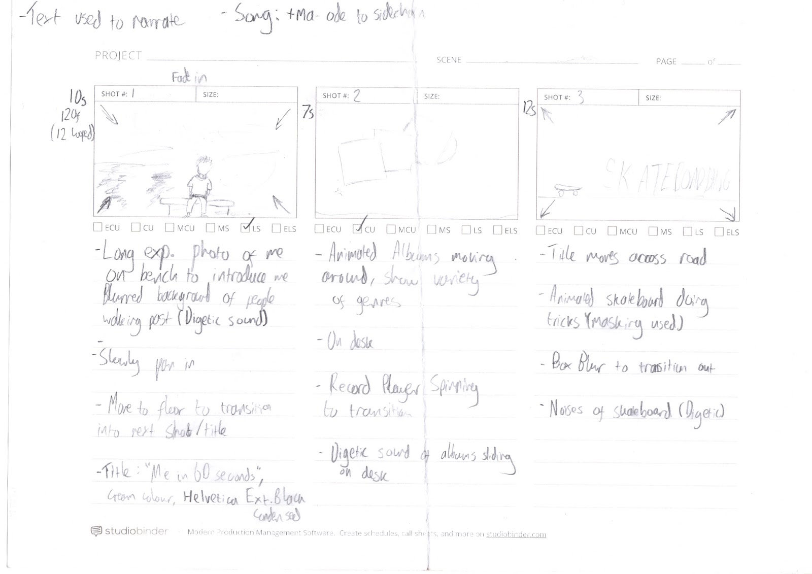
After this it was time to start planning our full photomations. I firstly started a document and listed some features that I wanted my video to have. These were:
-around 60 seconds in length
- add titles and colours grading when editing
-include skateboarding, certain music I like & photos I've taken
I also did a blog post researching how I want to present my video, and what size/ratio it will be. I decided to make it square so it can be posted both online on platforms like Vimeo and YouTube, and on mobile on Instagram.
After this I drew up a storyboard:
When it came to the final edit, some of the shots I storyboarded didn't make it as when making my photomation I experimented and tried to make an effective video with the things I had available to me. During shooting, I used a tripod to get some interesting birds eye view angles. I also used a tripod for other shots to make sure that the photomation wasn't shaky. I used a bridge camera with manual settings to ensure that the lighting stayed as consistent as possible in shots. If I was to do this again I would've used a DSLR for better looking images, with a high aperture. After I had taken all of the photos it was time to edit them together.
Firstly I arranged the different shots into folders so I could import them into Premiere as individual image sequences. At this stage I also deleted any bad photos and did some masking using Photoshop. This was for a shot where I made my skateboard appear to do tricks and essentially 'float'.
To do this I imported a photo of the skateboard on top of a jar so it was raised and then on another layer imported a background with no skateboard on. I then used the eraser tool to remove the jars. Lastly, I adjusted the Brightness/Contrast of the background layer so everything blended in. I did this for about 10 frames.
I Then composited the whole project in Premeiere Pro, arranging the clips alongside the music and adjusting the speed of some clips. I added titles to help narrate the video, as noted in my plan and storyboard using the Titles feature in Premiere Pro. The text looked boring at first and I wanted to give it some creative flair to make it look more interesting. Therefore I added a stroke and drop shadow to it, and changed the text colour from white to a range of pastel colours. I also changed the font. As the film is meant to represent me, I made the text look appealing to me.
In Adobe Premiere I also touched up each shot by adding an adjustment layer to each one.
In this adjustment layer I added the effect 'Three Way Colour Corrector'. This allowed me to adjust the hues of the shadows, midtones and highlights. It also can adjust the input and output levels and saturation.
After this, I had a section in the video where it says I take photos, and here I wanted to insert some photographs I've taken. I did this, but they didn't fit with the flow of the video as they were still and made it look a bit boring. Therefore I used photoshop to split them up between the foreground and background. I did this by cutting out the foreground subjects with the lasso tools and bringing them to sepereate layers. After this the original image had gaps in so I used content aware fill to fill in the gaps. Lastly, I touched up the gaps with the spot healing brush tool and clone tool. The background still looked a bit scruffy for a couple of images so I applied a gaussian blur to soften it.
Once I was done, I ended up with a layer for each subject in the foreground, and a background image. I did this for three photographs then moved onto Adobe After Effects.
In After Effects, I dragged in my seperated photographs (saved as .psd's) and put them into a new composition. I then used keyframes to change the scale of the background layer, and scale/position of the subject layers. This gave a 3D photo effect which made it look like the photograph was moving and I found it really effective and proffessional looking. I rendered the After Effects composition into a 5 second video for each photograph.
Keyframing my 'Photo Parallax' in After Effects
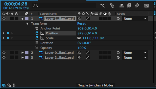
After I had done this, I moved back to Premiere and put in the photo clips I had made. The video was finally complete, however I still had to give it sound. I used a website called 'freesound.org' to search for copyright free sound effects I needed for my project. I downloaded them and added them to my timeline to sync them up with the video. This was fairly easy, however I had to adjust the volume of each sound so that it didn't clip and everything stayed under the -6dB mark in the audio levels in Premiere. This is a photo of my complete timeline:
Lastly, I rendered my video. It was a bit confusing, but as I was familiar with this process I managed to pick the right settings so that my video exported correctly in the best quality. I picked the H.264 format and made sure that the frame size was the same as my project (1280x1280).
If I were to do this again, I would have spent more time planning in order to achieve some more interesting shots with some variety. I'd also use a better camera with some shots that look stylish (e.g. using a shallow depth of field/long exposures). Maybe I would try to shoot at some different, cool looking locations too. The audio worked well I thought, however I could narrate with my own voice which is also something else to consider if I were to do this again.
The video fits well in the YouTube player and would also work well on Instagram if I decided to post it on there.

 Getting the price of a product is incredibly important when selling your own product, as you need to get the highest amount of profits with as little loss as possible. One example to consider is the law of diminishing returns, which refers to the point at which the level of profits is less than the amount of money/energy invested. This point needs to be identified accurately and acted on quickly.