

Kill Bill Vol. 1 (2003)
This film poster uses a specific colour scheme of yellow, red and black. The background is yellow, which is a bright colour therefore making it stand out and grab the viewers attention. The black text against the yellow stands out by contrasting against it, and the yellow and black connote danger or hazard (e.g. hazard tape, a bee/wasp).Another way the poster is effective is the text used. It is in all caps and the typeface (Impact) looks dramatic and serious. The title takes up almost a quarter of the whole poster.
Another way the film sells itself through the poster is by showing off the main actor, Uma Thurman who is famous and will make people want to go and see it. She is holding a weapon which suggests the film will contain violence making it seem more admirable to the target audience. She takes up almost half of the poster, which really makes her stand out and is likely to be the first thing the viewer will see when looking at the poster.
Goodfellas (1990)
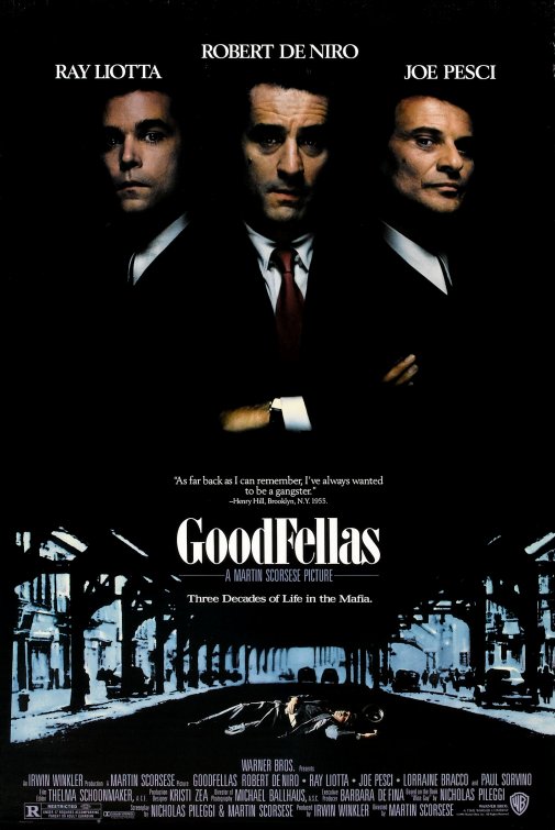
The Goodfellas poster is mainly black with some blue, a colour scheme which immediately suggests the film is going to be dark and could be sad. The top half shows three main actors, all famous, showing through the darkness. They are arranged as a group, symmetrically which makes the overall poster look more appealing. The actors names are all shown above their heads in white and all caps to stand out and fit with the dramatic theme connoted by the characters.The poster features a quote by a real person as well which is situated in the center, suggesting that it's significant. Underneath this is the title in a large, bold font, helping to bring attention to it. Alternative to Kill Bill, it is lowercase, suggesting formality.
The directors name is presented underneath the title, making the viewer more likely to watch it if they are aware of Scorsese's other films.
Lastly, a dead man in the street is shown which denotes the atmosphere set by the film.
Both posters have some similarities which make the viewers more likely to want to watch the films presented by their posters. One of these things is that the main actor(s) are shown and they are making eye contact with the camera. This creates intimacy with the character shown and the viewer in order to make them connect more with the poster. Another similarity is that the title of the film is made to stand out and is the largest of all the text shown on the poster. Lastly, both posters use a certain colour scheme which helps connote the overall themes and tones of the film.
(If you can, please fill in this survey about the Kill Bill Poster)
No comments:
Post a Comment