
Showing posts with label Media Theory. Show all posts
Showing posts with label Media Theory. Show all posts
Tuesday, 28 February 2017
Course Reflection
I created this prezi about the course reflecting on what I had learnt so far and what I found good and bad. I found that I prefer the more hands on practical tasks such as shooting and editing films & photos, as well as creating magazines and designing things. I also found projects focusing on hobbies or things i'm interested in the most enjoyable, such as the publishing task which focused on fashion and photography.
For my FMP I'd like to make a full magazine or lookbook, and a promotional video for it. I've chosen to do this because I'd like to do moving image next year and I enjoy fashion and photography, so this way I can incorporate both into my FMP.
Production Cycle
Pre-Production
Create a brand
Research magazines
Research fashion
Research photography techniques
Plan Magazine (Layout, composition)
Plan Promotional Video (Storyboard)
Production
Shoot photos for magazine, shoot video for promotional piece
Post Production
Edit promotional video
Edit together magazine
Print magazine
Promote on social media

Tuesday, 7 February 2017
Personal Mission Statement
After I finish this college course I'd like to pursue a career in some sort of media. I'd like this to entail some sort of creative task such as graphic design, publishing, editing or shooting videos/film. This is what I find most interesting and would have the most fun and best experience doing. Alongside this I'd like to travel to new places which I haven't seen before such as Australia, Japan, Canada and Africa. I'd also like to carry on doing my own creative projects outside of an occupation such as:
-Magazines
-Photography
-Videos
-Short Films
-Music
By doing this I think I'll be doing what I want as well as gaining experience and meeting new interesting people.
-Magazines
-Photography
-Videos
-Short Films
-Music
By doing this I think I'll be doing what I want as well as gaining experience and meeting new interesting people.
Updating my CV
When I rewrote my CV I changed a few things recommended by Helen from the futures hub who helped us in lesson with our CV's.
Firstly I took away my age as I learned this doesn't need to be specified on your CV. Next I made my personal statement shorter as this is what Helen gave me as feedback, as well as telling me that the statement should be specified to the job I'm applying to. For this reason I left my personal statement short as I can always add to it when specifying it to a job.
Something I amended to my CV due to feedback were dates to go with my education and past employment which makes it look more professional in my opinion. I also shortened my GCSE section because of feedback as before I had listed all my subjects and the grades I got in them.
The most noticeable thing I changed was the layout of my CV. I made the body of the text 11pt (as recommended by Helen) and the titles 14pt. I also changed the alignment, spacing and boldness of the text to make it neater overall and look clearer on the page. This will make it easier to read for a possible employer and they'll be less likely to bin it.
Link to Old CV
Link to New CV
Firstly I took away my age as I learned this doesn't need to be specified on your CV. Next I made my personal statement shorter as this is what Helen gave me as feedback, as well as telling me that the statement should be specified to the job I'm applying to. For this reason I left my personal statement short as I can always add to it when specifying it to a job.
Something I amended to my CV due to feedback were dates to go with my education and past employment which makes it look more professional in my opinion. I also shortened my GCSE section because of feedback as before I had listed all my subjects and the grades I got in them.
The most noticeable thing I changed was the layout of my CV. I made the body of the text 11pt (as recommended by Helen) and the titles 14pt. I also changed the alignment, spacing and boldness of the text to make it neater overall and look clearer on the page. This will make it easier to read for a possible employer and they'll be less likely to bin it.
Link to Old CV
Link to New CV
Sunday, 5 February 2017

Tuesday, 10 January 2017
Job Roles
| NAME OF JOB ROLE |
Adam Cook - Studio Technician
|
JOB DUTIES AND DAY TO DAY ACTIVITIES
|
Works with Studio Manager - Runs studio productions
Attends Pre Production meetings to decide which cameras to use and how many etc.
Works with Cameras & technical parts of productions
Oversees the work flow
|
PATHWAY TO JOB? (COURSES/QUALIFICATIONS/PREVIOUS JOBS ETC)
|
Studied Film Production at University and became interested in the technical side of Media, then got a runner position at Aardman which turned into a permanent position
|
PROS AND CONS OF THE ROLE
|
|
ADVICE GIVEN / SKILLS OR ATTRIBUTES NEEDED
|
Working on a production teaches more than an educational course teaches
Have to be good with people
|
DOES THIS ROLE INTEREST YOU? WHY/WHY NOT?
|
Yes, it seems like a very interesting job because it is fun and has variety within the role.
|
NAME OF JOB ROLE
|
Jake Cooper - Junior 3D Artist
|
JOB DUTIES AND DAY TO DAY ACTIVITIES
|
Works on a range of projects doing design, pitch work or work for delivery
|
PATHWAY TO JOB? (COURSES/QUALIFICATIONS/PREVIOUS JOBS ETC)
|
Studied 2 year College course on Game Development then did an internship at ‘Rewind’ for 3 months then was taken on full time
|
PROS AND CONS OF THE ROLE
|
|
ADVICE GIVEN / SKILLS OR ATTRIBUTES NEEDED
|
Must learn new software when it comes out, as it makes you more hireable
|
DOES THIS ROLE INTEREST YOU? WHY/WHY NOT?
|
Not interested as I don’t find games development appealing as a job and you need to know a lot about computing.
|
NAME OF JOB ROLE
|
Davi Stein - Head Of Compositing
|
JOB DUTIES AND DAY TO DAY ACTIVITIES
|
Gets a range of different 2D rendered layers and has to combine/layer them together
|
PATHWAY TO JOB? (COURSES/QUALIFICATIONS/PREVIOUS JOBS ETC)
|
Started in Compositing work for broadcast then wanted to work in film so moved to London and did compositing work for film there
|
PROS AND CONS OF THE ROLE
|
|
ADVICE GIVEN / SKILLS OR ATTRIBUTES NEEDED
|
Need to have an eye for it and be artistic
Teamwork/collaborating is important
Knowledge on colour
“Much easier to teach technical skill than artistic talent”
|
DOES THIS ROLE INTEREST YOU? WHY/WHY NOT?
|
Has variety which is good in a job but doesn’t appeal to me as a profession
|
I think that these 3 jobs above are all interesting jobs which are more unique than a daily office job. The first role, a Studio Technician is a profession which I think looks fairly fun and effective as a job as you work with a team and have a variety of things to work on in a month as opposed to doing the same thing daily. This is what the 3D artist profession and Compositing profession seem to be like. However these two jobs focus a lot more on creativity and having an eye for visuals which is a rare skill to have. This leads me to believe that these two would be more stimulating for a visual thinker and learner like me.
Friday, 18 November 2016
Infographic
For this task we were asked to make a short case study infographic on a product, company or person that has been rebranded. We had the choice to either use Photoshop or an online tool called Piktochart to make it, and had to research about the rebrand using the internet. I chose Microsoft as they rebranded quite recently and it was a very different style to what they had before. Here is the infographic I made:

Monday, 31 October 2016
Importance of Price
Concept to Shop Floor Timeline of making a product:
- Concept
- Brief
- Research
- Decide manufacturing method
- Complete your products design
- Create Prototype
- Test Prototype
- Manufacture & Package
- Pitch & sell the product
Product:
Skateboard Deck in Shrink Wrap
Price:
Costs about £10-£15 to make each, price varies with size of batch, £50 Retail, Discount if over certain amount is spent
Promotion:
The design on it could be done by an artist, Contains special technology, Show professional skaters riding it, advertise in skateboarding magazines, online (adverts, promotional videos)
Place:
Skate shops, Online, Trendy high street shops Getting the price of a product is incredibly important when selling your own product, as you need to get the highest amount of profits with as little loss as possible. One example to consider is the law of diminishing returns, which refers to the point at which the level of profits is less than the amount of money/energy invested. This point needs to be identified accurately and acted on quickly.
 Thursday, 20 October 2016
Skils Development
Firstly, in Moving Image and Media Theory I have developed my knowledge about film and the history of film. I've discovered how films have changed over time and how different shots connote different moods and feelings to an audience. I've found out how sound helps to tell a story and make it more effective, and the process of how it's done in the real world, which I didn't know before. Through this I learnt about foley artists and how to use a sound recorder to get my own sounds for my films, and how to edit them accordingly. I've also learnt how to effectively use Premiere Pro (which I had some knowledge of before) so that it backs up my project as I work, and lays out my footage in an organised and effective manner.
In my Audio lessons with Tom Grey I have learnt about audio and sound in more detail. He helped us further understand about sound in film, and how to use Premiere with sound design and music, so that the sound is mastered and doesn't clip. He also taught us about making photomations, and how to edit them in Premiere by importing photographs in a group called an Image Sequence.
Publishing with Ty has helped me learn how to be more efficient with photoshop, as well as develop my knowledge about graphic design and film posters. I already had basic knowledge of photoshop before these lessons, however he let us experiment with the program and discover new things individually. He also taught us a range of keyboard shortcuts and techniques to make us more efficient with the program. In these lessons I've produced some of my own film posters that I'm proud of, and gained some useful knowledge and skills which will be helpful later in the year.
 |
| Film Poster Mashup made in publishing (Design 1) |
 |
| Film Poster Mashup made in publishing (Design 2) |
 |
| Sprited Away Poster (Made in Publishing) |
 |
| Final Design of Spirited Away poster |
Lastly, Interactive lessons with Steve Spicer have been really useful in helping me develop my knowledge in design and how I look at pieces of work me or others have made. In these lessons I've learnt a lot about very important parts of Media such as colour, text and design. Steve taught us about colour theory and colour harmony, typography and connotations of typefaces which are very useful to know about, and have helped me in other lessons when designing things. I also learnt the basics of Adobe Illustrator which is a complicated program, made simple to understand in these lessons. Using it I have made infographics as well as gained knowledge on how to use it for making posters and 3d graphics.
 |
| Colour Wheel made in Interactive |
 |
| Image made in Interactive showing different parts of a typeface |
Overall I think that in this first six weeks I have learnt a lot about programs and theory which will be very helpful as this course goes on, and now I feel a lot more confident approaching tasks with this knowledge. I still have things to improve on however, one is being more effective at planning and putting more time into planning before getting into a task. Another improvement I could make to help my learning is to spend time doing independent research and work (i.e. outside of college) and giving evidence of this. In the next term and half term holiday I will definitely try to act on these improvements, be it watching a few films mindfully, reading a book or getting outside with my camera and experimenting with it.
This blog shows all examples of all of the skills I have listed, as well as the video below, which shows some examples of skills I have developed:
Wednesday, 19 October 2016
60 Second Sequence
For this short video my group used Oscar's hair and beard to our advantage, making a video featuring Jesus. I used a range of shot types to connote different things when shooting this video, which incorporated everything we'd been learning about film and sound.
Firstly, it opens with the sound of someone urinating which leads the viewer to wonder where the sound is coming from and who is creating it. Then the first shot is shown (A long shot) and you're introduced to James, which matches the sound with the visuals. The second shot is a close up of James face, which firstly shows the character in more detail and secondly shows his shocked emotion, leading the viewer to believe he can see something. The third shot is another close up, which keeps the level of intimacy and is a point of view shot because it's what James can see. After this the dream sequence starts, showing inside James's head. It uses some clips shot on a black screen, and one shot of James lying on the floor, with the camera looking down at him. I chose this shot because isolates James as he contrasts with the light floor.
When James is waking up from the dream, I chose to use a long shot to establish the new location and the figure stood behind James. Because it's so wide, it also looks dramatic and helps to build the dramatic tension. To further build the tension, I included a buildup sound effect. We also chose to use a stabiliser in the shot that moves towards Oscar, so that it was smooth and looked intense and cinematic. The last shot shows a close up of James's confused face for comedic effect.
Overall, I think that this video is fairly good, however if we had more time to film and plan it then it would be more effective. I also used audio from the camera footage as dialogue at the end, which should have been recorded separately. What I think went well were the shot types I chose to use and how the tension changes throughout the video.
Monday, 17 October 2016
Analysing A Scene
I decided to analyse this scene in Pulp Fiction, which is where Jules and Vincent are speaking to Brett. Firstly, the scene is established by a long shot, which shows the whole room along with the people inside it (apart from Vincent).
In this shot Jules is stood up, and symbolises power which is shown by his relaxed but intense body language, and size in the frame. The three other young men are all below Jules's line of vision, either lying/sat down, or stood back. This shot lasts 25 seconds before changing to a close up of Jules, which is a fairly long time.
This shot raises the tension as it changes to this just after he shoots his gun. You can see Jules's expression in detail and the audience can tell that he is a bold character.
It quickly changes to this mid shot, which shows the fear experienced by Brett, and his reaction to Jules's actions. It also keeps focus on the food on the table, as it is a significant part of the scene.
The shot shows Brett again but this time in a close up and his expression can be seen changing as he becomes more anxious and fearful.
The shot follows Jules in a close up again, but this time he stops moving towards the end of the shot and he leans further into the camera. This builds the tension more.
The camera returns to Brett and the audience are really shown his panicked attitude and he is stuttering. The alternating shots have also helped to build up tension to this point where it is peaking, making the whole audience feel tense and as if something is about to happen.
Finally, the pent up tension is released and Jules throws the table across the room, first shown by this mid shot which shows Bretts fearful body language. The action is connoted further as this shot lasts for under a second before changing to a long shot to show the effects on the environment.
 |
| Long Shot |
 |
| Close Up (Tracking) |
 |
| Mid Shot |
 |
| Close Up (Tracking) |
The shot returns to this close up, and it follows Jules as he walks around Brett, further raising the tension and giving the audience a sense of what the guy in the chair is seeing.
 |
| Close Up |
 |
| Close Up (Tracking) |
 |
| Close Up |
 |
| Mid shot, showing Jules and Brett from behind |
 |
| Long Shot showing the aftermath of the tension build up |
Monday, 10 October 2016
Pros & Cons of Primary/Secondary Research
One thing that all film posters contain is colour. Using Google Images to reseach, I found this picture which shows the effects of colour and how different colours connote different things:
Another piece of relevant information I found whilst conducting secondary research was this webpage that shows different font types used in film posters and how the font changes dependent on the genre.
 |
| (Source: https://rebeccahadley95.wordpress.com/page/3/) |
This article gives effective information on what makes a good film poster with seven different points that help towards making a poster look good. It refers to 'AIDA' which is an effective formula in marketing and is used in thousands of poster designs. It stands for attention, inform (the customer), direct benefit and action.
In order to further do some secondary research I visited the College library and found some books about design. Here are some that I found:




Overall, I found that secondary research is a lot more straightforward to gather and can provide a lot more information, despite not being specific. It's also easier to look further into a certain aspect of the research you're conducting when doing secondary research. Primary research is a longer process which takes more work, however it can be a lot more specified to what you want to do, and the information gathered is valuable. You can be sure that this information is also legitimate and up to date, unlike data gathered via secondary research.
In order to further do some secondary research I visited the College library and found some books about design. Here are some that I found:


 |
| This page described how the visual impact of a filmposter can relate to the film itself and vice versa,and that the poster alone can be incredibly influential in the films success. |
 |
| This page said that text in all caps can affect reading, and that Upper and lower-case letters should be used for optimum readability. It also contained some information about optimum pt. size for blocks of text. |
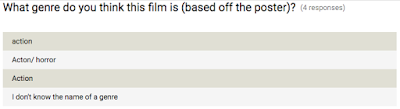
I also conducted some primary research about film posters, by making a short survey using Google Forms to get some information about peoples opinions on a film poster. Here are the results:

 |
| This shows that the colour scheme of the poster is effective in getting attention, as well as the simplistic design which helps the character to stand out. |

 |
| By including the director on the poster, the film appears a lot more likeable (dependent on who the director is, (e.g. Spielberg would be better than Vicky Jenson) |


The primary research didn't gather as much information as secondary did, however the results I did get were a lot more specific to what I wanted to know.
Overall, I found that secondary research is a lot more straightforward to gather and can provide a lot more information, despite not being specific. It's also easier to look further into a certain aspect of the research you're conducting when doing secondary research. Primary research is a longer process which takes more work, however it can be a lot more specified to what you want to do, and the information gathered is valuable. You can be sure that this information is also legitimate and up to date, unlike data gathered via secondary research.
Saturday, 8 October 2016
Comparing Briefs

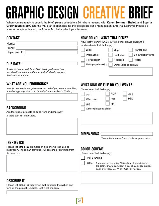

All briefs need to give a client an idea of what to produce in a project, however depending on what the project is the brief will change. It must give the designer milestones, objectives and aims. All three briefs here show this. Another point that should be considered is the commissioning companies image and how they are portrayed to their customers or audience. This is another important point, as the target audience should be provided. From this the designer can generate some idea in their head of the language and design schemes to use. Additionally, the commissioner should give their main aim of what they want the project to do (e.g. generate sales) which is evident in all of these briefs.
The second brief I found is specifically for graphic design, and therefore it is designed to obtain more specific details such as a file format which would be irrelevant in other briefs. Although it still contains the basics of any brief which is a deadline and project idea.
The third brief attached has a section for budget, which isn't evident on others as this isn't always set and may need negotiation.
Wednesday, 5 October 2016
Adding Sound to My Silent Film
Today in Media Theory I had to record and add sound to my silent film. To do this, me and my group watched the film a few times and took note of all of the sounds going on that needed to be replicated, not forgetting ambient noise. After this we went out to record and did this in a variety of ways.
One hard part of recording was getting ambient noise and car sounds from outside without the wind interfering with the clips. To solve this problem we shielded the microphone, however some wind was still audible. In the end we just waited for it to stop and recorded at those times. Something which worked well was using Max's bag to make sounds in a silent room. This helped us to create realistic sounding effects which we needed.
After we had all our sounds recorded, we had to edit them into our films separately. This wasn't too much of a hard task software-wise, however some of the sounds needed adjustments. To make them fit I changed the speed and pitch of some of them. Lastly, I downloaded some royalty free sounds from freesound.org to fill in any gaps where our recordings weren't good enough. This is the end product without music:
Overall I think this audio has made the film more effective. This is because firstly it gives the story being told more depth and realism because the viewers ears will tune in to the sound alongside the visuals. Another way the sound is effective is that it helps to add pace and drama to the film e.g. the footsteps added to the chase scene make it more fast paced. In the opening of the video the sounds are effective in setting the atmosphere of the film, through the ambient sounds which show its outdoors in the street. Lastly, sound was effective as it made the video funnier. When action takes place like a fall, the sound helps to add impact to it.
Overall, I think that by adding sound, the film has been improved and portrays a better story, although it doesn't really fit as it's a silent film and adding sound doesn't make it true to it's time.
This is the finished product with the added sound and music.
One hard part of recording was getting ambient noise and car sounds from outside without the wind interfering with the clips. To solve this problem we shielded the microphone, however some wind was still audible. In the end we just waited for it to stop and recorded at those times. Something which worked well was using Max's bag to make sounds in a silent room. This helped us to create realistic sounding effects which we needed.
 |
| My Premiere timeline showing all of the audio clips alongside my silent film. |
Overall I think this audio has made the film more effective. This is because firstly it gives the story being told more depth and realism because the viewers ears will tune in to the sound alongside the visuals. Another way the sound is effective is that it helps to add pace and drama to the film e.g. the footsteps added to the chase scene make it more fast paced. In the opening of the video the sounds are effective in setting the atmosphere of the film, through the ambient sounds which show its outdoors in the street. Lastly, sound was effective as it made the video funnier. When action takes place like a fall, the sound helps to add impact to it.
Overall, I think that by adding sound, the film has been improved and portrays a better story, although it doesn't really fit as it's a silent film and adding sound doesn't make it true to it's time.
This is the finished product with the added sound and music.
Monday, 3 October 2016
Textual Analysis of Two Film Posters

Kill Bill Vol. 1 (2003)
This film poster uses a specific colour scheme of yellow, red and black. The background is yellow, which is a bright colour therefore making it stand out and grab the viewers attention. The black text against the yellow stands out by contrasting against it, and the yellow and black connote danger or hazard (e.g. hazard tape, a bee/wasp).Another way the poster is effective is the text used. It is in all caps and the typeface (Impact) looks dramatic and serious. The title takes up almost a quarter of the whole poster.
Another way the film sells itself through the poster is by showing off the main actor, Uma Thurman who is famous and will make people want to go and see it. She is holding a weapon which suggests the film will contain violence making it seem more admirable to the target audience. She takes up almost half of the poster, which really makes her stand out and is likely to be the first thing the viewer will see when looking at the poster.
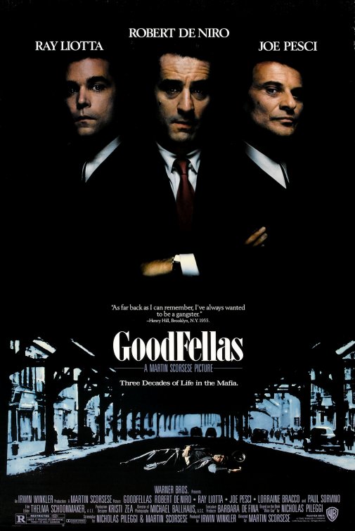
Goodfellas (1990)
The Goodfellas poster is mainly black with some blue, a colour scheme which immediately suggests the film is going to be dark and could be sad. The top half shows three main actors, all famous, showing through the darkness. They are arranged as a group, symmetrically which makes the overall poster look more appealing. The actors names are all shown above their heads in white and all caps to stand out and fit with the dramatic theme connoted by the characters.The poster features a quote by a real person as well which is situated in the center, suggesting that it's significant. Underneath this is the title in a large, bold font, helping to bring attention to it. Alternative to Kill Bill, it is lowercase, suggesting formality.
The directors name is presented underneath the title, making the viewer more likely to watch it if they are aware of Scorsese's other films.
Lastly, a dead man in the street is shown which denotes the atmosphere set by the film.
Both posters have some similarities which make the viewers more likely to want to watch the films presented by their posters. One of these things is that the main actor(s) are shown and they are making eye contact with the camera. This creates intimacy with the character shown and the viewer in order to make them connect more with the poster. Another similarity is that the title of the film is made to stand out and is the largest of all the text shown on the poster. Lastly, both posters use a certain colour scheme which helps connote the overall themes and tones of the film.
(If you can, please fill in this survey about the Kill Bill Poster)
Wednesday, 28 September 2016
Peer Assessment
Why do we do peer assessments?
We peer assess each others work which involves giving constructive criticism in order to help each other improve. By giving an opinion about a peer's work, you can identify any problems you thought you saw, and give them a review from a different persons perspective as people see things differently.
The peer assessment can help the individual being assessed to improve and try new things, suggested by a peer.
Today I peer assessed Curtis's Silent Film: "The Thief"
Today I peer assessed Curtis's Silent Film: "The Thief"
It is a very funny short film which contains some great use of slapstick comedy, a common convention of silent films. Some points I identified to improve on were the titles, as the font used isn't that old looking and as it is the first thing the viewer sees, it needs to set the tone of the film. Another point is that there is a moment at around 10 seconds in where the shot changes to a close up which is at an angle. This doesn't follow the style of silent film as all shots were medium/long and completely flat. Lastly, there are no text frames to show dialogue, which can help to put across the story better.
Overall, I thought this was a brilliant attempt at a silent film, following most of the codes and conventions commonly seen in old pieces. It had good acting and slapstick comedy, a fitting soundtrack and was of course in black and white.
Wednesday, 21 September 2016
The Importance of Demographics
Demographics are very important as they are a way of categorizing people. These people can provide valuable information about the habits, likes and dislikes of certain ages, genders and groups. Information like this is valuable because it enables us to serve the needs and preferences of our ideal target audience for whatever we're trying to sell.
Concerning research, demographics are also very important because it can help to identify new opportunities. This is because it can show a gap in the market for whatever is being researched, showing what can be done that hasn't yet. This could be a new, innovative product or a gripping new film that appeals to a wide audience.
Concerning research, demographics are also very important because it can help to identify new opportunities. This is because it can show a gap in the market for whatever is being researched, showing what can be done that hasn't yet. This could be a new, innovative product or a gripping new film that appeals to a wide audience.
Subscribe to:
Posts (Atom)