I thought that this was a very creative animation. I liked the use of string to make characters because of how unique it was and how it was made to fit in with the story. The animation was effective however in my opinion the faces of the characters looked a little childish and creepy, but this didn't affect the film much.
One thing which I thought was really clever was the story and use of numbers to represent the status of a character. It's clever because it can be related to our lives and be seen as an extended metaphor. I also liked how by putting two O's together, the "zero's" make a "∞", the highest number. This gave the dark story a happy and feel good ending. Overall I think that the story was moving and effective in putting across the message not to judge people by how they look/come across.
The technique of using string to animate is too fiddly for me to try out myself, however it does look good so I might try something similar if I end up doing stop motion animation again at some point. My favourite thing about this video was the use of numbers to represent status, and my least favourite thing was the strange faces of the characters.
How Will You Die?
This was very different from the first film we were shown, the biggest difference being that it was made digitally using computer animation. I thought that it conveyed the public health message effectively and was fairly comedic in doing so. The animation was colourful which is eye catching and used a cartoon style character to represent a human. The film used a scratchy grunge texture for the background which I thought looked a bit out of place and scruffy, but apart from this I thought it looked good. It used repetition and comparisons for comedic effect and to further emphasise the message of the film that people are dying because of things which are seen as luxuries in richer parts of the world. One last thing which made me appreciate the film more was that it was quick and to the point, which made it more pleasurable to watch.
If I were commissioned to do this project, I would take a similar approach and use cartoon characters that aren't very human like to represent humans, so that the film isn't too realistic and saddening. One thing I'd do differently however would be to give it a sleeker more professional look, as I thought the film we were shown looked quite scruffy and homemade.
In the past 2 weeks with Steve we've been focusing on animation. When I first found this out I was pleased because I find stopmotion fun and quite nostalgic as I used to watch a lot of Wallace and Gromit, Morph and Shaun the Sheep. As well as this, I used to do some stopmotion myself with lego, but when we came to do the tasks I was a little rusty.
In lessons we watched some animated shorts which I enjoyed a lot as they were all quite different from each other and looked visually engaging to me. The variety in each animation showed us how stopmotion is a creative artform and doesn't have many boundaries. For example we watched Svankmejers "Darkness, Light, Darkness" which used plasticine and meat/body parts to animate with - an interesting technique I'd never seen anything like before. In contrast to this, we watched "The Fat Cat" which used wax as an animating medium.
Overall, the past two weeks have been intreguing and have helped us explore into the world of stopmotion in depth. I went on to watch more of Svankmejer's shorts and other less popular Aardman shorts after these lessons. We also had a go at doing stopmotion ourselves which proved time consuming, but the end result is appealing to watch as you can see the characters you've created move by themselves in an environment you've created. Below is a very short stopmotion me and Max made on the theme of winter.
In Europe, stopmotion started as a means of storytelling and was seen as magic because it gave the illusion of objects moving around by themselves. The first use of stop motion was done by Albert E. Smith and J. Stuart Blackton in 1898, who made "The Humpty Dumpty Circus". The US didn't pick up on it properly until 35 years later however. As it gained popularity it was used for entertainment such as cartoons, as well as for visual effects in films and television. By the 90's, CGI got more popular so stopmotion wasn't really used anymore for professional purposes and got less popular.
Because it stopped being used much in film, it was more impressive when used as it takes a lot of time to do and looks handmade and real as opposed to computer imagery. It is a very versatile means of filmmaking which can be done with a range of different materials or techniques. One which stood out for me which I'd maybe like to pursue is stopmotion done with pictures as a sort of collage, like this video:
I like it because it looks visually appealing and bright. It also has a retro, abstract quality which I think looks unique and cool.
In audio, we had the task of making our own photomation. A photomation is a sequence of images, which when played in succession look like moving video. In the first week we experimented with photomation and made our own short videos using the technique. I found it was quite easy to do but very time consuming as it involved taking a picture, moving the subject a fraction, then taking another picture and so on. The editing was also fairly straight forward, as we were taught how to import our photos as an image sequence into Premiere. This way the program could handle the footage a lot better and the photos were all grouped into one video clip. Here is the video I made experimenting with Premiere and Photomation:
Because it was like skateboarding, I added some effects on Premiere to make it look like it was filmed witha a fisheye lens. This made the video look more fitting.
After this it was time to start planning our full photomations. I firstly started a document and listed some features that I wanted my video to have. These were:
-around 60 seconds in length
- add titles and colours grading when editing
-include skateboarding, certain music I like & photos I've taken
I also did a blog post researching how I want to present my video, and what size/ratio it will be. I decided to make it square so it can be posted both online on platforms like Vimeo and YouTube, and on mobile on Instagram.
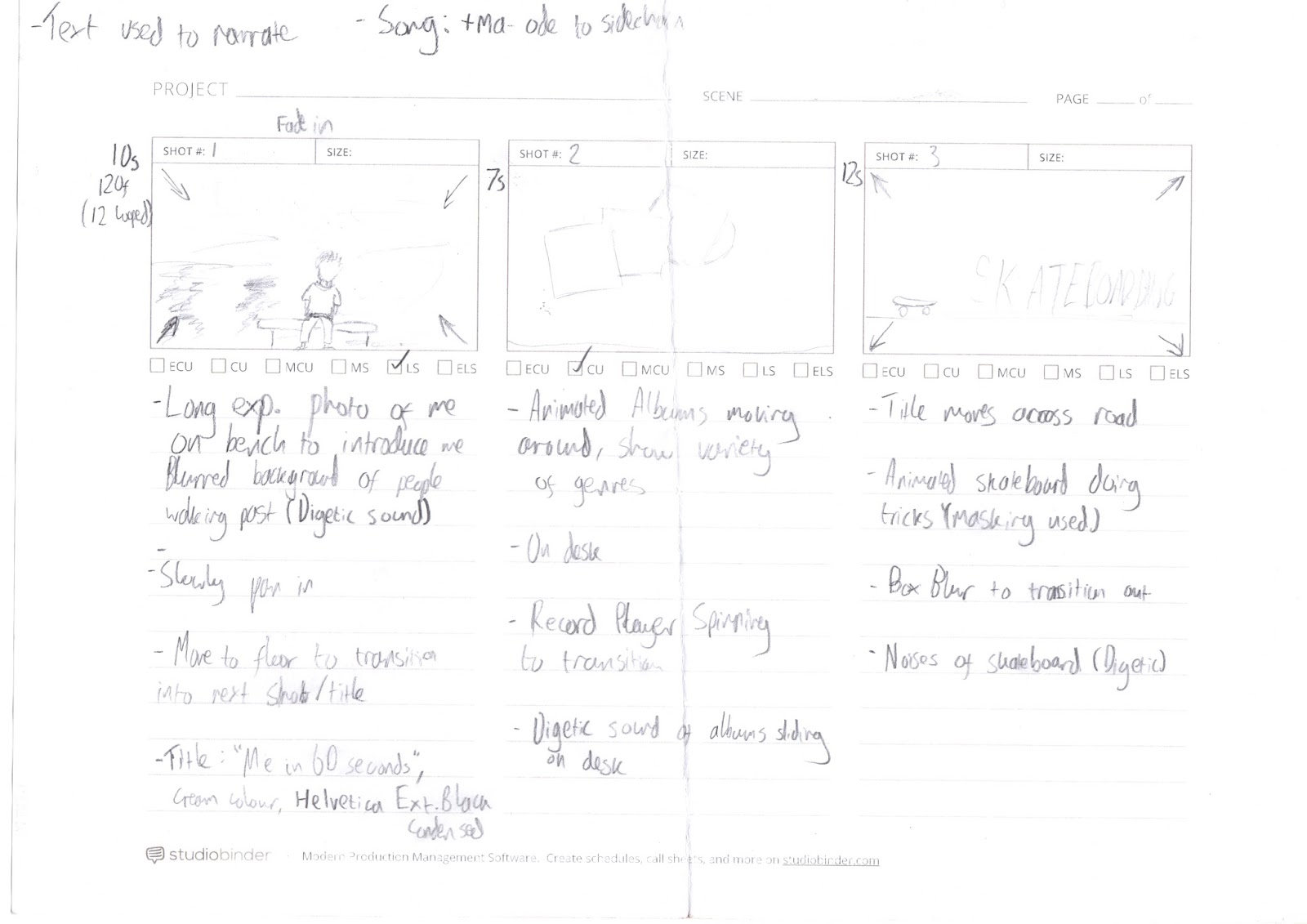
After this I drew up a storyboard:
When it came to the final edit, some of the shots I storyboarded didn't make it as when making my photomation I experimented and tried to make an effective video with the things I had available to me. During shooting, I used a tripod to get some interesting birds eye view angles. I also used a tripod for other shots to make sure that the photomation wasn't shaky. I used a bridge camera with manual settings to ensure that the lighting stayed as consistent as possible in shots. If I was to do this again I would've used a DSLR for better looking images, with a high aperture. After I had taken all of the photos it was time to edit them together.
Firstly I arranged the different shots into folders so I could import them into Premiere as individual image sequences. At this stage I also deleted any bad photos and did some masking using Photoshop. This was for a shot where I made my skateboard appear to do tricks and essentially 'float'.
To do this I imported a photo of the skateboard on top of a jar so it was raised and then on another layer imported a background with no skateboard on. I then used the eraser tool to remove the jars. Lastly, I adjusted the Brightness/Contrast of the background layer so everything blended in. I did this for about 10 frames.
I Then composited the whole project in Premeiere Pro, arranging the clips alongside the music and adjusting the speed of some clips. I added titles to help narrate the video, as noted in my plan and storyboard using the Titles feature in Premiere Pro. The text looked boring at first and I wanted to give it some creative flair to make it look more interesting. Therefore I added a stroke and drop shadow to it, and changed the text colour from white to a range of pastel colours. I also changed the font. As the film is meant to represent me, I made the text look appealing to me.
In Adobe Premiere I also touched up each shot by adding an adjustment layer to each one.
In this adjustment layer I added the effect 'Three Way Colour Corrector'. This allowed me to adjust the hues of the shadows, midtones and highlights. It also can adjust the input and output levels and saturation.
After this, I had a section in the video where it says I take photos, and here I wanted to insert some photographs I've taken. I did this, but they didn't fit with the flow of the video as they were still and made it look a bit boring. Therefore I used photoshop to split them up between the foreground and background. I did this by cutting out the foreground subjects with the lasso tools and bringing them to sepereate layers. After this the original image had gaps in so I used content aware fill to fill in the gaps. Lastly, I touched up the gaps with the spot healing brush tool and clone tool. The background still looked a bit scruffy for a couple of images so I applied a gaussian blur to soften it.
Once I was done, I ended up with a layer for each subject in the foreground, and a background image. I did this for three photographs then moved onto Adobe After Effects.
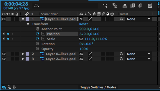
In After Effects, I dragged in my seperated photographs (saved as .psd's) and put them into a new composition. I then used keyframes to change the scale of the background layer, and scale/position of the subject layers. This gave a 3D photo effect which made it look like the photograph was moving and I found it really effective and proffessional looking. I rendered the After Effects composition into a 5 second video for each photograph.
Keyframing my 'Photo Parallax' in After Effects
After I had done this, I moved back to Premiere and put in the photo clips I had made. The video was finally complete, however I still had to give it sound. I used a website called 'freesound.org' to search for copyright free sound effects I needed for my project. I downloaded them and added them to my timeline to sync them up with the video. This was fairly easy, however I had to adjust the volume of each sound so that it didn't clip and everything stayed under the -6dB mark in the audio levels in Premiere. This is a photo of my complete timeline:
Lastly, I rendered my video. It was a bit confusing, but as I was familiar with this process I managed to pick the right settings so that my video exported correctly in the best quality. I picked the H.264 format and made sure that the frame size was the same as my project (1280x1280).
If I were to do this again, I would have spent more time planning in order to achieve some more interesting shots with some variety. I'd also use a better camera with some shots that look stylish (e.g. using a shallow depth of field/long exposures). Maybe I would try to shoot at some different, cool looking locations too. The audio worked well I thought, however I could narrate with my own voice which is also something else to consider if I were to do this again.
The video fits well in the YouTube player and would also work well on Instagram if I decided to post it on there.