Apatosaurus Brontosaurus Dinosaur -->
Showing posts with label Steve Spicer. Show all posts

Tuesday, 28 February 2017

Reflection - Interactive

For the past term with Steve we have been learning all about animation and how to use the program 'Adobe Animate'. Over these lessons I have learnt a lot about the program which I had little knowledge on before, and created many digital animations. We started by learning the basics of the program and understanding what it does for the first few lessons, then advanced onto learning it's specific tools and features. Since I started I feel like I have gained a lot of knowledge about digital animation and Adobe Animate. There's some things which I can still improve on like making longer animations or learning even more of the programs functions such as the bone tool, however I'm confident in making small animations using the variety of features I've already learnt.

One more thing which I learnt was how to incorporate my animations together into an interactive product using Adobe Muse, giving it the ability to become a functioning website or app. This is useful to know and produces a professional looking product.

This is the first animation I made in our interactive lessons
when messing around with the program. As you can see
I had some basic knowledge of the program prior to teaching.
It's fairly clunky and could be improved by adding more detail
or making the movements more realistic.

This is an animation I made in Animate to experiment with
motion tweens. Again it works but could have more detail.

This is an animation I made frame by frame to experiment with
the technique. It took a fairly long time to do however I was
pleased with the rough style result.


I made this animation experimenting with shape tweens, something
I had no idea how to use before these lessons. It was easy to do
and created a unique looking animation.

I created this scene using symbols to duplicate the penguins as
opposed to drawing them out repeatedly. This was a new skill
that I learnt.

This is a reference sheet I created for my character 'The Blob'. I learnt how to
do this in Steve's lessons and it turned out very helpful for when I came to
make animations for this character.

This is an animation I made of the Blob
eating for the final interactive product
I made. It's smooth and is a big
improvement from the first animation
I made. It could be improved however
by making it a little slower.


Tuesday, 21 February 2017

Sunday, 5 February 2017

Mary Shelley's Frankenstein - Sketches

In Steve's lesson we were set the task of going out into Bath and sketching a few locations related to Mary Shelley - the author of Frankenstein. She wrote the book when she was living in Bath so in our groups we went to certain locations related to her residence there. We then had to present these sketches in the form of a map (below). We also had to draw our own Frankenstein which didn't follow any stereotypes. I went with a long haired male monster with a missing eye and two belly buttons.

Tuesday, 13 December 2016

Making the Blob Wait

After we'd drafted the character, we had to animate it... doing nothing. I made the stage the resolution of an iPhone 6 screen (1080 x 1920) then grabbed the sketch of my character front on from the model sheet and converted it into a symbol. Then I made it get slightly bigger and then return to its original state using motion tweens. This gave the illusion of it breathing. To improve, this animation, I'd like to make the character blink at random.

Character Draft

In lesson we had to create a character to later animate. I kept it fairly simple and made this blob. It changes colour when feeling different emotions (red=angry, green=envy, blue=sad etc.). I first drew him as a doodle (pictured below) when I got sidetracked from trying to draw a human.
I liked the look of it so developed it into a character, and drew it from many different angles on this model sheet, with some different expressions and the colours that go with them.

Shape Tweens

To create a shape tween I drew my initials with the brush tool, then went 10 frames ahead and drew my initials in a wavy style. Inbetween these two frames (frame 5) I clicked and selected 'Create Shape Tween'. This was the end result:

Motion Tweens

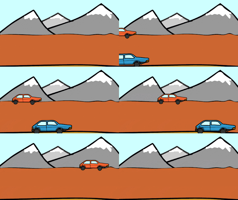
For this task we had to use motion tweens. I made an animation of 2 cars racing. Motion tweens are a simple way of animating an object which is fairly effortless compared to frame by frame animation. To do it, I drew a car and duplicated it to make a second in a different colour, then converted them both to symbols. Then, in the timeline I right-clicked the frame with the car on and chose "Create Motion Tween", then I moved the car to the finishing point. I did this for the other car and drew a background. Lastly, I double clicked on the motion tween in the timeline and added 'ease' so that the cars sped up smoothly.

Tuesday, 29 November 2016

Symbols & The Library - Penguins

In Interactive we had to learn about symbols and use them in our own Animate document to make an image of penguins. I drew a penguin with the brush and filled it in with the paint bucket, then used the selection tool to draw a box around the penguin to select it. Once selected, I right clicked the penguin and converted it into a symbol. Then, I was able to drag the penguin in from the library onto the stage, so I ended up with 4 penguins. Lastly I drew a background and resized the penguins to give the image perspective.

Drawing Expressions

Today in Interactive Steve gave us the task of drawing a range of expressions. To have some reference, we had to take pictures of us showing these different emotions using Photo Booth, then draw a simple representation of these emotions. I used photoshop to draw with and these are my illustrations:

Friday, 18 November 2016

Drawing Tools - Adobe Animate

In Steve's lesson this week, we learnt about a program called 'Adobe Animate' (previously Adobe Flash). He gave us a brief idea of how the program works. It has a timeline which is made up of frames which can be drawn on. I learnt that a lot of big companies start out in this program or programs similar to it, which helped me realise that it can be very complex, despite being easy to use for simple frame by frame animation. Programs such as 'The Amazing World of Gumball' are animated using Adobe Animate.

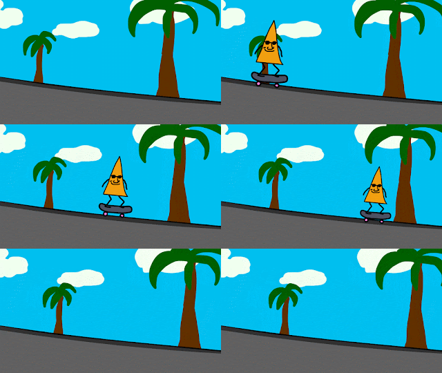
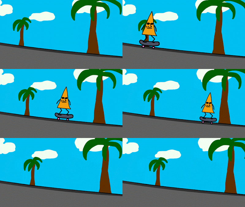
After we had learnt a little bit about the program, we were allowed to have a mess about on the program ourselves. I had used this program before to make a short animation for my entertainment, so I knew some things about it already. As we were short for time, I used motion tweens to make different background layers move to create perspective, instead of drawing them repeatedly for each frame. I also drew a character that looked uncannily like a dorito which I converted to a symbol so I could move it with a motion tween too. I animated it for 3 frames and looped it so that it gave the effect of him wobbling around. This is the .gif I made:


Tuesday, 15 November 2016

'Zero' & 'How Will You Die?' Review and Opinions

Zero

I thought that this was a very creative animation. I liked the use of string to make characters because of how unique it was and how it was made to fit in with the story. The animation was effective however in my opinion the faces of the characters looked a little childish and creepy, but this didn't affect the film much.

One thing which I thought was really clever was the story and use of numbers to represent the status of a character. It's clever because it can be related to our lives and be seen as an extended metaphor. I also liked how by putting two O's together, the "zero's" make a "∞", the highest number. This gave the dark story a happy and feel good ending. Overall I think that the story was moving and effective in putting across the message not to judge people by how they look/come across.

The technique of using string to animate is too fiddly for me to try out myself, however it does look good so I might try something similar if I end up doing stop motion animation again at some point. My favourite thing about this video was the use of numbers to represent status, and my least favourite thing was the strange faces of the characters.

How Will You Die?

This was very different from the first film we were shown, the biggest difference being that it was made digitally using computer animation. I thought that it conveyed the public health message effectively and was fairly comedic in doing so. The animation was colourful which is eye catching and used a cartoon style character to represent a human. The film used a scratchy grunge texture for the background which I thought looked a bit out of place and scruffy, but apart from this I thought it looked good. It used repetition and comparisons for comedic effect and to further emphasise the message of the film that people are dying because of things which are seen as luxuries in richer parts of the world. One last thing which made me appreciate the film more was that it was quick and to the point, which made it more pleasurable to watch.

If I were commissioned to do this project, I would take a similar approach and use cartoon characters that aren't very human like to represent humans, so that the film isn't too realistic and saddening. One thing I'd do differently however would be to give it a sleeker more professional look, as I thought the film we were shown looked quite scruffy and homemade.

Friday, 11 November 2016

Stop Motion Reflection

In the past 2 weeks with Steve we've been focusing on animation. When I first found this out I was pleased because I find stopmotion fun and quite nostalgic as I used to watch a lot of Wallace and Gromit, Morph and Shaun the Sheep. As well as this, I used to do some stopmotion myself with lego, but when we came to do the tasks I was a little rusty.

In lessons we watched some animated shorts which I enjoyed a lot as they were all quite different from each other and looked visually engaging to me. The variety in each animation showed us how stopmotion is a creative artform and doesn't have many boundaries. For example we watched Svankmejers "Darkness, Light, Darkness" which used plasticine and meat/body parts to animate with - an interesting technique I'd never seen anything like before. In contrast to this, we watched "The Fat Cat" which used wax as an animating medium.

Overall, the past two weeks have been intreguing and have helped us explore into the world of stopmotion in depth. I went on to watch more of Svankmejer's shorts and other less popular Aardman shorts after these lessons. We also had a go at doing stopmotion ourselves which proved time consuming, but the end result is appealing to watch as you can see the characters you've created move by themselves in an environment you've created. Below is a very short stopmotion me and Max made on the theme of winter.

Tuesday, 8 November 2016

Stopmotion

In Europe, stopmotion started as a means of storytelling and was seen as magic because it gave the illusion of objects moving around by themselves. The first use of stop motion was done by Albert E. Smith and J. Stuart Blackton in 1898, who made "The Humpty Dumpty Circus". The US didn't pick up on it properly until 35 years later however. As it gained popularity it was used for entertainment such as cartoons, as well as for visual effects in films and television. By the 90's, CGI got more popular so stopmotion wasn't really used anymore for professional purposes and got less popular.

Because it stopped being used much in film, it was more impressive when used as it takes a lot of time to do and looks handmade and real as opposed to computer imagery. It is a very versatile means of filmmaking which can be done with a range of different materials or techniques. One which stood out for me which I'd maybe like to pursue is stopmotion done with pictures as a sort of collage, like this video:

I like it because it looks visually appealing and bright. It also has a retro, abstract quality which I think looks unique and cool.

Tuesday, 1 November 2016

Short Stopmotion Review

Ident
This short video is a dark animation that follows the routine of one individual. I think it's trying to show how people put on a 'mask' in everyday life to change themselves or act in a way which is expected. It also shows other people and how they can change this 'mask'. Overall I liked the style of the animation and it was fun to watch, however it's hard to understand what it's really about as it's abstract and there's no dialogue.

Darkness, Light, Darkness
This short video showed a human body slowly being made out of plasticine, by its hands. The animator used real meat in the animation which was unique and strange to look at, and overall the video was abstract but had some humour and was creative. For the whole video the setting stays the same, a small room which after a quick google search shows that it could be representing a cramped style of living or something similar. I preferred Ident to this video.

My Own Stopmotion
Lastly, we worked in groups of two to have a go at making our own simple stopmotion using iMotion:

Tuesday, 18 October 2016

Colour Harmonies

There are many ways that colours can compliment and work with each other, each one has a different 
name and rule that it follows. 
Complementary
Complementary colour schemes are two colours that are opposite each other on the colour wheel. They give a lot of contrast but work well together in most circumstances, if the saturation of the colours are at their fullest.
Here complementary colours have been used and a high amount of contrast
is created. This makes the piece stand out a lot.
Analogous
Analogous Colors are groups of three colours that are next to each other on the colour wheel, with one being the dominant colour. They look good together because of how close they are on the colour wheel and are balanced well.

Triad
Similar to analogous colours, a Triad of colours are three colours that are evenly spaced around the colour wheel. They are balanced, but contrast a lot so stand out a fair bit.
Here we can see that the Burger King logo
has used a triadic colour scheme, which
gives it it's vibrant appearance.
Square
A square colour scheme takes 4 colours that are evenly spaced around the colour wheel. It's similar to a triad but with one colour added, so therefore it will produce quite vibrant results and will work well with bright colours.

Split Complementary
Split complementary colours are similar to complimentary however it takes the colour opposite it and uses each colour which is beside that.
The Firefox logo uses a split
complementary colour scheme of
blue, yellow and orange.
Tetradic
A Tetradic colour scheme is made by drawing out a rectangle on the colour wheel. It gives four colours, 2 each which complement each other.


Gamut

The word 'Gamut' simply means a complete range or scope of something. However when colour is concerned a gamut means a range of colours available on a certain device or platform. For example, a computer or tv screen displays colours by mixing RGB light, so the gamut is fairly large (as shown by the diagram below). A print based piece such as a newspaper or magazine uses CYMK mixing to display colour, and therefore the gamut is smaller. A gamut is useful if you want to preview how something is going to look when printed, as it can show the range of colours available on the device being used.

Difference Between Colours in 1960s + 1970s + 2016

Colours in the 1960's were very bright and psychedelic because it was a decade of change and freedom. Some examples of the trending colour schemes are Andy Warhol's pop art which used very vibrant colours, The Beatles's Yellow Submarine Film, and the fashion of teenagers and young adults at the time.


These colour trends were heavily influenced by the hippy drug culture at the time, as the use and availability of LSD and Marijuana increased (hence the vibrant psychedelic colours). Additionally music figures like The Beatles and Elvis Presley influenced colour trends, as well as the desire for freedom and change as the war was over and people were happy and relaxed.

As the 60s passed the colour trends changed again with culture, and at this point vibrant, bright colours became less popular changing to calm, more sophisticated earthy solid colours like beiges and browns. The country was recovering from another war, so peace and calm were reflected in these warm earthy tones.

Nowadays, the trending colours that have stood out to me are golds and yellows which were incredibly popular during the summer, and pastel colours such as baby pink and light blue. Here is a list of the top 10 colours of spring 2016 I found.

How Many Colours in  a GIF?
-256

What is the Colour Mode of Photoshop?
Photoshop has a range of colour modes that can be selected, these are:
Bitmap, Grayscale, Duotone, Indexed Color, RGB Color, CMYK Color, LabColor, or Multichannel

Monday, 17 October 2016

Colour Theory

Colour is incredibly important in the design industry and is very effective to an audience. Different colours can connote completely different messages and its the first thing a viewer will pick up, both consciously and subliminally. A simple colour can say a lot about a piece (e.g. it's core message/context/genre) without any other text or imagery. To understand colour we had to learn about mixing colours and the colour wheel. We did a short test where we discovered that there are lights; Cyan, Magenta and Yellow (which can be mixed to make other colours). These are the colours that should be used when painting. On a computer, it's different, as the colours used to make colours are Red, Green and Blue (or RGB). Both of these mixing techniques can be worked out using the Colour Wheel.
In our Interactive lesson with Steve we had the task to make our own colour wheel to help further our knowledge of colour. We had to make the colour wheel using our own photos, so in groups we went into Bath looking for colours. Most of the main colours on the very outside of the wheel were fairly easy to find around Bath, some could even be found inside College. Magenta and Purple proved fairly hard to find however. As we went on with our hour to gather as many colours as possible, I discovered how it was quite a painstaking task to find the lighter colours seen closer to the center of the wheel, however I managed to gather most of them.

Once our time was up we returned to class to arrange our photos into a colour wheel. I used Photoshop and the wheel pictured above as a template for mine. With the magic wand tool and many, many layers I made my colour wheel. The final product is pictured below:


Saturday, 8 October 2016

Adobe Illustrator

Adobe Illustrator is a program used commonly by artists and graphic designers which can be used to create digital imagery. Within the program the user has the ability to create anything from freehand drawings to graphs and logos. Images created within the program are vector images which means they can be scaled to any size without losing quality. Instead of remembering pixels the program remembers shapes. When shapes are made in Illustrator they have a path.

Paths are lines created in illustrator when something is drawn or created. They are made up one or more curved or straight lines that can be altered with great accuracy. Each segment has an anchor point at each end, which can be used to change the shape of a path or position of a segment. Anchor points can also be dragged to change the curvature of a segment.

Once a shape has been made it's appearence can be manipulated by changing the fill and stroke. The stroke of an object is it's outline and within Illustrator you can change it's thickness and colour in the stroke panel. You can also change it's apperance by giving the line a different style like denim stitching or making it dashed. Lastly the stroke panel can further alter the stroke by changing how the ends and corners of paths look (e.g. curved/bevelled/arrowheads). The fill is what goes inside of the object and it can be a colour or pattern. The fill can be selected at the bottom of the toolbar.

Tuesday, 13 September 2016

My First Impressions of the Creative Media Course at Bath College

This week I am starting my first proper week of the Creative Media course at Bath College. The environment is a contrast from repetitive secondary school which I have been attending for the past 5 years. I am pleased to experience a change.

Over these first few weeks we are going to be partaking in lessons which cover a variety of different aspects of media and I'm looking forward to those concerning filmmaking, typography and colour. 

this is a picture I took of my friend standing on a bin