Apatosaurus Brontosaurus Dinosaur -->
Showing posts with label Graphic Design. Show all posts

Tuesday, 18 October 2016

Colour Harmonies

There are many ways that colours can compliment and work with each other, each one has a different 
name and rule that it follows. 
Complementary
Complementary colour schemes are two colours that are opposite each other on the colour wheel. They give a lot of contrast but work well together in most circumstances, if the saturation of the colours are at their fullest.
Here complementary colours have been used and a high amount of contrast
is created. This makes the piece stand out a lot.
Analogous
Analogous Colors are groups of three colours that are next to each other on the colour wheel, with one being the dominant colour. They look good together because of how close they are on the colour wheel and are balanced well.
Triad
Similar to analogous colours, a Triad of colours are three colours that are evenly spaced around the colour wheel. They are balanced, but contrast a lot so stand out a fair bit.
Here we can see that the Burger King logo
has used a triadic colour scheme, which
gives it it's vibrant appearance.
Square
A square colour scheme takes 4 colours that are evenly spaced around the colour wheel. It's similar to a triad but with one colour added, so therefore it will produce quite vibrant results and will work well with bright colours.

Split Complementary
Split complementary colours are similar to complimentary however it takes the colour opposite it and uses each colour which is beside that.
The Firefox logo uses a split
complementary colour scheme of
blue, yellow and orange.
Tetradic
A Tetradic colour scheme is made by drawing out a rectangle on the colour wheel. It gives four colours, 2 each which complement each other.


Gamut

The word 'Gamut' simply means a complete range or scope of something. However when colour is concerned a gamut means a range of colours available on a certain device or platform. For example, a computer or tv screen displays colours by mixing RGB light, so the gamut is fairly large (as shown by the diagram below). A print based piece such as a newspaper or magazine uses CYMK mixing to display colour, and therefore the gamut is smaller. A gamut is useful if you want to preview how something is going to look when printed, as it can show the range of colours available on the device being used.

Monday, 17 October 2016

Colour Theory

Colour is incredibly important in the design industry and is very effective to an audience. Different colours can connote completely different messages and its the first thing a viewer will pick up, both consciously and subliminally. A simple colour can say a lot about a piece (e.g. it's core message/context/genre) without any other text or imagery. To understand colour we had to learn about mixing colours and the colour wheel. We did a short test where we discovered that there are lights; Cyan, Magenta and Yellow (which can be mixed to make other colours). These are the colours that should be used when painting. On a computer, it's different, as the colours used to make colours are Red, Green and Blue (or RGB). Both of these mixing techniques can be worked out using the Colour Wheel.
In our Interactive lesson with Steve we had the task to make our own colour wheel to help further our knowledge of colour. We had to make the colour wheel using our own photos, so in groups we went into Bath looking for colours. Most of the main colours on the very outside of the wheel were fairly easy to find around Bath, some could even be found inside College. Magenta and Purple proved fairly hard to find however. As we went on with our hour to gather as many colours as possible, I discovered how it was quite a painstaking task to find the lighter colours seen closer to the center of the wheel, however I managed to gather most of them.

Once our time was up we returned to class to arrange our photos into a colour wheel. I used Photoshop and the wheel pictured above as a template for mine. With the magic wand tool and many, many layers I made my colour wheel. The final product is pictured below:


Saturday, 8 October 2016

Adobe Illustrator

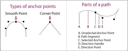
Adobe Illustrator is a program used commonly by artists and graphic designers which can be used to create digital imagery. Within the program the user has the ability to create anything from freehand drawings to graphs and logos. Images created within the program are vector images which means they can be scaled to any size without losing quality. Instead of remembering pixels the program remembers shapes. When shapes are made in Illustrator they have a path.

Paths are lines created in illustrator when something is drawn or created. They are made up one or more curved or straight lines that can be altered with great accuracy. Each segment has an anchor point at each end, which can be used to change the shape of a path or position of a segment. Anchor points can also be dragged to change the curvature of a segment.

Once a shape has been made it's appearence can be manipulated by changing the fill and stroke. The stroke of an object is it's outline and within Illustrator you can change it's thickness and colour in the stroke panel. You can also change it's apperance by giving the line a different style like denim stitching or making it dashed. Lastly the stroke panel can further alter the stroke by changing how the ends and corners of paths look (e.g. curved/bevelled/arrowheads). The fill is what goes inside of the object and it can be a colour or pattern. The fill can be selected at the bottom of the toolbar.

Wednesday, 5 October 2016

Elements of Photoshop

Layers

A big part of photoshop is it's layers feature, which for some circumstances is essential. They are like stacked pieces of transparent plastic which can be moved on top of or underneath each other with different content on each layer. Within the layers feature, you can manipulate how each layer acts. This can be done by changing their transparency using the opacity, with layer masks, or by changing the blending. Blending and layer masks can be used to create double exposures like that seen in The Revenant's Poster.

Text Tool

The text tool is a very versatile tool which allows you to add text to a document on photoshop, then adjust the font, style, colour, size, leading, kerning and more. This is an essential element and can be used in pretty much anything. Text can also be arranged into certain shapes and paragraphs.

Crop Tool

The crop tool is pretty self explanatory and may seem simple, however it is a needed element which can actually be fairly complex. It allows you to crop in to a photo so that it's a smaller size, or crop outwards to make a larger canvas. While cropping in or out you can also rotate the crop window to change the area of the image that is being cropped. As well as this, you can change the crop ratio to ensure that the end crop result will be a specific ratio e.g. 1:1 (Square), 4:3 or 16:9.

Liquify Tool

The liquify element can be used to manipulate the structure of an image. Within it it has a range of different tools that can shrink/bulge an image, as well as push/pull parts of it around. This doesn't have many practical uses as it's quite destructive, however it is known to be used on pictures of models to alter body shape.