Primary Research
Poster: Blair Witch Location: Odeon
Fonts: Serif, All Caps, Formal, Loose Tracking
Colours: Red & Black
Size: Quad
Economic: 2 Colours used, no shading
Constituent Elements: Symbolism, Slogan, Release date, Production company, Social medias
Style: Minimalistic, connotes evil
Artistic/Commercial: 30% commercial, 70% artistic
Target Audience: Under 25 as it is a horror film
Poster: Captain Fantastic
Location: Little Theatre Cinema
Title Font: Mix of serif and sans serif fonts in all caps
Other Fonts: Sans serif, capitalised, quotes in italics
Colours: Pastel colours and natrual aqua colours
Size: Quad
Economic: No, a range of colours with an image included
Constituent Elements: Presents main characters, looking at camera to create intimacy with viewer, Reviews, Star actors name
Style: Minimalistic, eye grabbing
Artistic/Commercial: 50/50
Target Audience: Appeals to all four quadrants
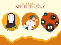
From this research I had a go at designing my own poster for Spirited Away:

Reflection on my poster design
To make this poster I used the Ellipse tool to make the clouds at the bottom of the poster and the circles, as well as the eyes for the soot creatures. Other shape tools I used are the Polygon Tool for the gold and the Rectangle Tool for the background. I had to research how to make a star shape in photoshop to draw the soot creatures, and I sourced the other characters from the internet, which I would draw myself if I had enough time. Lastly I used the text tool for the title.
In the original poster I made, it didn't look that effective to me because the colours didn't follow a specific scheme. Therefore the poster wasn't eye catching and looked jumbled. The posters I researched both had a specific colour scheme to give a certain mood/atmosphere e.g. Blair Witch was red and black for horror, so I decided to change the colours of my poster.
In the original poster I made, it didn't look that effective to me because the colours didn't follow a specific scheme. Therefore the poster wasn't eye catching and looked jumbled. The posters I researched both had a specific colour scheme to give a certain mood/atmosphere e.g. Blair Witch was red and black for horror, so I decided to change the colours of my poster.
I updated my poster with an orange and red colour scheme, to connote nature and warmness. It also made the poster more visually appealing. Overall I think the poster is effective and it shows the title & director which stand out, however it is missing out a lot of common features usually seen on posters that I listed in my research. Firstly it doesn't have credits at the bottom which are evident on all real film posters. I could've extended the bottom of this poster to make space for credits. Another feature missing is reviews and ratings which help to make the film more desirable to an audience. Lastly, to make the poster more realistic I could add production company logos and additional information about the film. This would make it's appearance more legitimate and professional looking. I left out the log-line and release date as I wanted to keep the posters minimalistic look.
For my next design, I aim to add all of the features which I missed out this time, especially a credits block at the bottom as this helps the poster to look real. I'm also going to make sure I add a release date as this is necessary for all films.
For my next design, I aim to add all of the features which I missed out this time, especially a credits block at the bottom as this helps the poster to look real. I'm also going to make sure I add a release date as this is necessary for all films.

No comments:
Post a Comment