Apatosaurus Brontosaurus Dinosaur -->

Thursday, 11 May 2017

FMP - Development

For the production of my Final Media Project I planned to make a short magazine based on youth culture (more specifically music, art & fashion) and a 30 second advertisement to promote it. I aimed to print the magazine so it could be presented as a physical publication rather than digital.

I wanted my magazine and advert to pastiche retro 80's/90's style and design, so I made a moodboard in pre-production to try and show the 'look' I was going for. I aimed to make sure I kept to this style throughout production. 

Magazine Development


Front Cover

To start off with my magazine production I referred to the flatplan I made during pre-production and began to create the magazine page by page in Photoshop. For each single page I opened a new document in Photoshop and selected the preset 'International Paper > A5'. For double page spreads I made a document like this but doubled the width.

I started with the front page, which I planned to include the title and a photograph. I came up with many different names, and whittled them down to three: 'Creators', 'Carpe Noctem' and 'Youth'. I decided on 'Carpe Noctem' meaning 'seize the night' because I liked the twist on Carpe Diem and thought that it was unique.
After coming up with this name I set out with the front page. At first I wanted it to just be a solid colour with a title:
I tried this with a few different colours and fonts, but thought this looked a bit boring and bland, because there was a lot of dead space. I therefore decided to replace the solid colour with a photograph. I used some photographs I shot on film on a sunny day which had nice colours and retro undertones thanks to the film photography. Through my experimentation with 35mm film I was able to develop my design for this front page and choose fitting images.
I liked the flame font from before as I thought it gave off a real 90's aesthetic, so I stuck with it. After trying a few different photographs I stuck with this one:
I chose this one because the white text looked good against the blue sky and effectively stood out. The photograph makes for an appealing front cover due to the yellow flowers complimenting the deep green tones from the leaves and the light blue sky. The light clouds also match the title colour. My view of the colours was helped by my research on colour theory.

Title Pages
After my primary and secondary research I drew some conclusions as to what I should include my magazine and how it should be laid out. One thing I discovered from my research was the effectiveness of splitting the magazine into sections, giving each different section a title page, similar to iD magazine. I wanted to go for a font similar to the one used on the front page, and also wanted it to be simple. In the end I decided with a black, flame style font on a white background. I liked the font because it looked hand drawn and as if it had something more than just a title. It made it look more interesting. Here are a few examples of the final title pages I made:
One problem I ran into when creating these pages was making sure that the letters all lined up seamlessly so it looked neat and hand drawn. I did this by adjusting the tracking in the character window of photoshop as shown. 


Interview Pages
Most of the content in my magazine is interview based. It has four interviews in total and they all follow a similar design pattern as I wanted to magazine to be neat and uniform. I went about doing these interviews by getting in contact with the people and asking if they were willing to be interviewed, then I came up with a list of questions and asked them. 
Two of the interviews I did were recorded and typed up (Aiden May and Ben Coleman) and the other two took place in messages online. For Aiden and Ben's interviews I printed out the questions, and recorded me asking them with the answers using a Zoom H4N microphone borrowed from college. I could then listen back to this and type it up into photoshop. For Reuben Robinson and Cale Labbe's interviews, I sent them the questions one by one over email and copied and pasted the responses into photoshop.

As far as design goes for the interviews I used rulers in photoshop to split the page into two, then from this created columns for the text to go in. This made it look neat and uniform. For the type in the interviews I decided to use the same retro looking font throughout to fit in with my theme. 


To differentiate the questions from the answers, I made the text of the questions bold. After typing up the interview, I was able to make spaces for images because of the text being bound to a box. I was able to press enter making breaks in the type to make room.

When adding the images to the interview, I made sure they all had around the same colour scheme and that they were related to the interview so that it looked uniform, visually appealing and nothing clashed. As an example I'm using the double page spread interviewing Aiden May. I shot the photographs of Aiden on film in London with him, and took photos showcasing him and his clothing pieces, because the interview focuses on fashion and Aidens involvement in it. I also made sure that when choosing the photos I used the ones with prominent greens, browns and skintones.
From the whole roll of film I chose to use the portrait of him outside the shop as I thought this image was stylish and introduced the subject well. I also chose the photograph of his shoes as these are the pair he mentions just above the image on the page. Lastly I used the photograph of him walking in the tunnel as it had the same colours as the other two photos and fitted nicely over half of the page. It also shows Aiden with shopping bags which I thought was fitting.

Magazine Layout
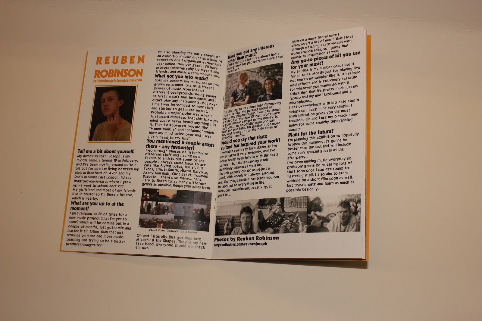
When compiling the rest of my magazine, I went through some changes to the layout and design to make it fit in with the overall style. One of these things was the layout for Reubens interview. 

I thought that it looked a bit bland, so I changed the colour of the title to match his t-shirt colour in the portrait, and added a border of the same colour to the image using the rectangle tool. The border idea was inspired by my research when looking at 'Dazed' magazine, as they used a similar design technique. Below are before and after images of the changes I made to improve the layout:

Another layout change I made was on a double page spread of my photography near the end of the magazine. At first I had one photograph taking up the whole page and another on a white background.

I decided to reduce the size of the full page photo and add a border to both images, which made them match more and look better side by side:


However I still thought this looked a bit bland, so I decided to add a background because I felt this gave the photos context and set a scene. The vivid colours and high saturation of the background made sure that this fitted in with the style.


Final Magazine
After typing everything up and laying out all of the photos and images I had created a full magazine.
I named each page with a number to order them, as before the files were all jumbled and unorganised. By numbering each page it prepared them to be printed into a physical magazine. I also made a .pdf with all of the pages in one file as a digital version and hard copy which I could make amendments to. 

Advert Development

When starting the production of my advert I had a fairly clear idea of what I needed to do due to me storyboarding and creating a shot list in advance. I only had 8 things to shoot on camera as the rest of the advertisement would be graphics in the form of titles or animations. 

I started off by putting together all of the digital parts of the advertisement according to the storyboard in Premiere Pro. In the storyboard I had planned out all of the colours, titles and transitions I wanted to use in the video. I decided to use the same font from the magazine title in the title of the advert to give the name its identity.
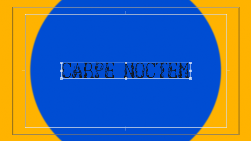
The first shot is animated and has circles which reveal the title. I did this by using keyframes, although it looked fairly artificial at this point.

To solve this, I added some directional blur to the circles to create motion blur, to make the movements look smoother. I also added a small amount of gaussian blur to soften the circles.
The beginning scene ended up looking like this:

Another big part of the advert was the timing to music. I wanted it to flow well and keep the viewers attention and therefore wanted all of the editing to be in time with the song I used. To make sure of this, I zoomed into the audio track in order to see the waveform. This way I could make the cuts and see where they relate to the song.

To shoot the actual video parts of my advert, I set up a greenscreen for the shot of the magazine spinning around. I originally set it up in my room however it was fairly dark and the lights gave off an orange tone. I therefore did it in my sisters room in the daytime as it has large windows which let in lots of natural light. To give the illusion of the magazine floating, I attached a piece of green string to the inside of it so I could hold it up. Below are the pictures of the setup.
I also shot some footage of the magazine being held and read in front of the greenscreen for the advertisement.

At the end of the advert I added a link to the shop online where the viewer would be able to buy the magazine. I thought this was okay but I decided to add a qr code that once scanned takes the viewer straight to the website. This not only adds ease of access but also makes the advert more up to date (which is comedic due to its very not up to date style).
Here are before and after screenshots of the end frame:

This is the first render of the advertisement:


At this point I thought it looked good however I wanted it to have more of a retro style. To solve this I opened it in after effects and applied lots of effects to the video to try and superimpose a vhs style to the video. This included blurring the channels, adding some frame jitter, distortion and a noise and static overlay. After adding these effects the advertisement looked really stylised and I thought it fitted the aesthetics and style well. This is the final render:

Website Development
Finally, I put together a fake website to sell the magazine. I used the company 'bigcartel' for this online shop as they set it up and make it user friendly to create a shop. I stayed with the generic template and adjusted the colour scheme to follow that of the magazine in the sidebar.
I also used photoshop to create a header image, using the magazine title font to keep continuity within the brand. I made sure it had the same colour background as the background colour of the website so that it blended in.
After this I shot some photographs of the magazine to use on the website. I did this in the studio against a large white piece of card to give them a clean, professional looking background. When shooting the photos I shot in RAW format so I could edit the photos non destructively. These are some of the photos I shot:
I used one of the images to show the magazine as a product and the rest of them on the website in a gallery on the homepage. 
I thought this looked good however the borders made the photos look dark and unprofessional. To solve this I used photoshop to cut the backgrounds out of the image which made it look a lot more professional and made the design look a lot neater.
After this I thought that the site looked complete and authentic. Here is a link to it.


Tuesday, 25 April 2017

FMP - Pre Production

Moodboard

For pre-production planning of my magazine I used photoshop to create a moodboard, which showed images/themes similar to those I'd like to present in my Magazine, as well as fonts, styles and colours. I chose a lot of old 80's and 90's styles because I really like the common design conventions, colours and fashion of that era. It can be seen below:


Magazine Plan

I sketched out a quick a plan of pages for my magazine, however when I looked back at it I realised that the number of pages was uneven so if this magazine were to be printed out it would not go together properly and would be unorganised. For this reason I created a flatplan to list what each page of the magazine will feature. To do this I signed up to a free trial on a website called Blinkplan, which allowed me to create a simple plan. Each representation of the page below states what will be shown on each page.
I made a flatplan because it helped me organise my magazine and see how everything would be laid out. It also acted as a checklist for each page for me.

Advertisement Test Shoot


As part of the pre-production for my FMP, I did a test shoot for the magazine advert I'm planning to make in order to promote the product. I shot Aiden in front of the green screen so that I could key out the background and make it a solid colour as I plan to do with the real advert. I had Aiden pretend to hold and read the magazine, as in the advert I plan to use small sections of video and heavily edit them with colours, repetition and shapes. It will rely heavily on post production editing.

What went well with this test shoot was the initial idea of shooting on a green screen, as it enabled me to have footage of an isolated subject which I can go on to heavily edit and time to music.

What didn't go so well which I need to improve on when I shoot the real thing is the lighting and green screen. As you can see from the video, it's quite glitchy and scruffy, as the green screen had folds in and wasn't lit properly, so there was more than one colour to key out. For the final advert I want the footage to be clean and professional.

Other than that I think that this test shoot went well and I'm confident to shoot the real advertisement.

Storyboard

To plan my magazine advertisement, I drew up a storyboard to plan out how it was going to look and get down each shot I had in mind. Because most of it is going to be title and graphic based, I drew down how I wanted it to look on screen and annotated colours that I was going to use and how the text would look (bold, large etc). Along with this I wrote a short description of each shot, and what transition to use (if needed) to the left of the frame. After this I decided to type up a shot list for further information on shots when needed.

Shot list

For the shot list I listed all of the shots which would be shot on camera (therefore excluding all graphics such as titles & animations). I listed the shot type, angle (if applicable) and a description of what was happening. This was essentially just to organise all of the shots which I needed so I could list off when I shot them and be reminded of what to shoot. 


Sunday, 23 April 2017

FMP - Research/Experimentation Reflection

During the research period of my FMP I hoped to find out how the final product of my FMP should turn out and what I should include in it. I produced both primary and secondary research - primary through the form of a survey, experimentation and looking at similar products to mine, and secondary through looking online and in books about design & magazine production etc. Out of both of these methods I found primary to be more useful as you could choose what to look at specifically, as well as getting answers more related to your project. I found out a lot of new information through research but the most effective was inspiration (looking at similar products) and what to include in my magazine (survey).

After this research taking place I feel like the project is a lot more organised in my head and I have a clearer idea of what has to be done. If I had to list the three most important findings I discovered in my research they would be design skills, camera skills and what to present in my magazine. From this research my idea has become a lot more refined and focused on specific subjects.


Saturday, 22 April 2017

FMP - Text Experimentation

To find out how to present text in my project I created these three sample titles and paragraphs in photoshop. I used a generic common font - Helvetica. Here are the three images I created:


Firstly, I thought that all lowercase looks informal in a paragraph but very effective and visually appealing as a title.

The capitalised text looked good in long passages but not as good as a title, although as a subheading would be fairly effective.

Lastly I thought that the all caps text was an eyesore and didn't look good in a paragraph at all. As a title it's not too bad but I prefer lowercase.

From this experimentation I have concluded that when I compile my magazine I will use lowercase text and maybe some all caps text for titles, as this is the most visually appealing way to present it, and I will use regular capitalised text for passages of text.

FMP - Lens Experimentation

Fisheye Lens

For this I used the Polaroid Studio Series 52/58mm fisheye lens. It was a very bright and sunny day and I used quite a high aperture which stayed around f16 and a low shutter speed of around 1/100. I also used the flash on my camera to really help the subject in the foreground be lit up. These are some of the photographs I shot:


I like the style of these photos especially the distorted perspective created by the lens. A lot can be seen in the photograph due to the very wide field of view which I also think looks very visually appealing. The only downside to this is the edges of the lens which can be seen around the edge of the photos, and the fact that that images are circular. To solve this I could zoom in to get rid of the circle and have a tighter field of view. 


FMP - Research

Survey Research

To research for my final media project I created a survey using google slides to find out peoples opinions on certain things. The questions are as follows:


I got 26 responses and concluded some answers from these.
The first results made it clear that photographs are more appealing in magazines than text. I decided from this that my magazine will contain and focus mainly on photographs and images of art etc, with the occasional caption or article of text. This will make it more interesting and appealing.

This question focused on potential topics I can include in my magazine and show which I should focus on. There's two obvious topics which have the highest amount of votes which are art and music, so I will definitely include these in my magazine. I have already planned to get in contact with some local artists and musicians to interview and include work from in the magazine.

The two other topics which had a high amount of votes are youth culture and fashion. I also will
involve these topics in the magazine.

Lastly I asked about magazine length and found out what people think is the ideal length for a magazine. As shown by the pie chart the answers were fairly even, however 12-18 and 18+ pages had an even amount of votes so I aim to make my magazine around 20 pages long (including a cover and blurb). 

Overall I think creating this survey was helpful as I could get an overview of how my magazine should (loosely) turn out. By finding what is most appealing to people I was able to shape how my production would go so that my finished product will be as good as it can be.

Similar Print Product Research

To get inspiration and a better idea of how to present my magazine, I looked at similar magazines to what I imagine mine to be like. I looked at Tyler the Creators "Golf Book", an issue of "iD Magazine" & an issue of "Dazed". 

Firstly I looked at the Golf Book which was very colourful. It contained lots of photography and the photographs were laid out in an unorganised format (kind of like a collage) which I thought looked unusual and interesting.

There were also pages which were filled with one photo and no context. I thought that this really bought attention to the photograph and story behind it with no distractions which I also liked.

By looking at the 'Golf Book' I was able to get some ideas on layout and design which I can take as inspiration for my magazine when I go on to the next step: production.
Next I looked at iD magazine. I really liked how they separated the magazine into themed segments using title pages to split them up. This is because it gave the magazine form and made it easier to read. I plan to use this technique in my magazine. I liked the boldness and simplicity of the title pages used in iD.

Lastly I looked at "Dazed" magazine. I liked the retro font and how it was centred. I thought this looked neat and stylish. I also liked the layout of the first photo as it was centred and had a border that fitted the monochrome colour scheme. I plan to use retro styled fonts in my magazine in order to give people a feeling of nostalgia/make it look stylised.
By looking at these products, I was able to determine how to layout the pages of my magazine. It gave me ideas on how to present titles, photos and more. When I go into production and design the magazine, it will be a lot easier for me now. 

Looking at the physical magazines also made me look at the pages and cover and how everything is printed, which led me on to thinking about how I should print my magazine, the paper I should use, the weight it should have and the finish it should have.

Magazine Print Research

I plan to present my FMP magazine in print format. In order to find details and specifics for my magazine I ordered a free sample pack from http://www.stressfreeprint.co.uk/ to get a feel of the different paper weights and finishes.

This is the package I recieved in the post.
 It came with different samples of print products which each had a
description on of the paper finish, weight and size.


After looking through the samples I found a leaflet which was perfect for how I wanted the pages to be. It was 170gsm with a semi gloss finish. I liked this because the paper was thick enough to look good quality and professional, but still act as a page and not be too thick. The gloss finish made the pages look appealing and kept the photos looking vibrant and interesting. Because there's a heavy amount of colour and photos in my magazine, I thought that this finish would be the most effective.


I also found a brochure which was staple bound. I decided this is how I will bind my magazine together. It looks slightly less professional however still works effectively for the amount of pages I have. It is pretty discrete and doesn't affect the pages at all. If I were to have a lot more pages then I would have better binding e.g. 'perfect bound'.

The brochure also had a 250 gsm matt cover which was fairly thick and I thought it was a good weight for the front and back pages of the brochure. The matt finish felt professional and nice to touch, and made the printed pattern look colourful and stand out. For my magazine I would like the paper to be a bit thicker (around 300gsm) but other than that I thought this was a good cover.

From this research I concluded that I will print my magazine in A5 size with 170gsm semi gloss pages. It will have a 300gsm matt cover and be staple bound. This research helped me to determine which paper thickness and finish was best for me, and as I could check it out hands on it was very useful.

Print Company Research

Because I wanted to have this magazine printed to physical copies, I had to find a company which would print a very small amount of copies. Luckily I already had one in mind. At the start of this FMP in my pitch I said that I would use the company 'Mixam' to print it. This is because I have used this company before to print posters and they are quick, cheap and reliable.

The website it is all laid out very user-friendly, with explanations of everything. It also gives an instant quote which is useful because it shows how the cost is affected by changes of each magazine feature. 

I decided to get 15 made because if I went any lower the price would stay the same. By making this amount I could have one to give to my lecturer, have one to keep, and have a few leftover to give to my friends, mum, dog etc... 

I think that the main reason I'm using this website is because of its versatility and freedom to change each feature of the magazine (gsm, finish, colour, binding, pages), along with the instant quote.

Advert Inspiration Research


Lastly to do research for my magazine advertisement I found some videos in a similar style to what I'd like the advertisement to be like.
Firstly this music video has a retro style and uses mixed media as well as vibrant colours for effectiveness. I hope to replicate these styles in my advert and plan to do this through the use of still photography being shown in the video and abstract colour correcting. Additionally what is shown on screen is timed to the music so everything appears to be moving very smoothly and in a uniform way. I hope to time my advertisement to music in post production.
This editorial video showcases fashion items of clothing, and uses heavy editing for effect. Something I'd like to try and use in particular for my advert is the use of cropping and inclusion of VHS style video. I have already experimented with VHS cameras/effects and will be able to effectively show this in my advertisement. This video is also cut to be timed to the music which I plan to do.

Lastly this music video I found features a lot of heavy editing and animation. I like how a small section of video is used and built upon through duplicating it and drawing on it etc. I plan to use some animation in my advert, done in Adobe Animate. Thanks to my past interactive lessons I know my way around this program.


Monday, 3 April 2017

FMP - 35mm Film Experimentation

Due to the fact that my magazine will be primarily photo based, I decided to test out film photography as an alternative to digital. I used some very cheap film from poundland to shoot with (AFGA Vista Plus) and I got my film processed and put onto a CD at boots for just under £10. I used the Canon EOS 300 film camera to shoot on and took it around with me for a week shooting anything that I thought would look good.

These are some of the best photos I got, unedited and edited:


I decided from this to use some film photography in my magazine. It really stands out and has a raw style and colour type that really stands out and can't be achieved in the same way with digital phot

ography. It's quite a costly alternative to digital, which is why I'll only be using it for some photos. Using film photography for some images in my magazine will really help it stand out and furthermore give off the style which I'm trying to acheive in this project. Additionally, having a limited amount of photos really helped me think about what I'm shooting as opposed to mindlessly snapping hundreds of photographs.