Apatosaurus Brontosaurus Dinosaur -->

Tuesday 28 February 2017

Reflection - Interactive

For the past term with Steve we have been learning all about animation and how to use the program 'Adobe Animate'. Over these lessons I have learnt a lot about the program which I had little knowledge on before, and created many digital animations. We started by learning the basics of the program and understanding what it does for the first few lessons, then advanced onto learning it's specific tools and features. Since I started I feel like I have gained a lot of knowledge about digital animation and Adobe Animate. There's some things which I can still improve on like making longer animations or learning even more of the programs functions such as the bone tool, however I'm confident in making small animations using the variety of features I've already learnt.

One more thing which I learnt was how to incorporate my animations together into an interactive product using Adobe Muse, giving it the ability to become a functioning website or app. This is useful to know and produces a professional looking product.

This is the first animation I made in our interactive lessons
when messing around with the program. As you can see
I had some basic knowledge of the program prior to teaching.
It's fairly clunky and could be improved by adding more detail
or making the movements more realistic.

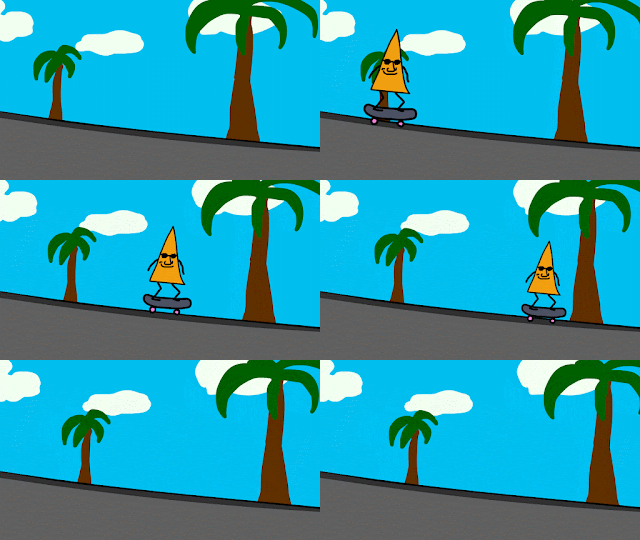
This is an animation I made in Animate to experiment with
motion tweens. Again it works but could have more detail.

This is an animation I made frame by frame to experiment with
the technique. It took a fairly long time to do however I was
pleased with the rough style result.


I made this animation experimenting with shape tweens, something
I had no idea how to use before these lessons. It was easy to do
and created a unique looking animation.

I created this scene using symbols to duplicate the penguins as
opposed to drawing them out repeatedly. This was a new skill
that I learnt.

This is a reference sheet I created for my character 'The Blob'. I learnt how to
do this in Steve's lessons and it turned out very helpful for when I came to
make animations for this character.

This is an animation I made of the Blob
eating for the final interactive product
I made. It's smooth and is a big
improvement from the first animation
I made. It could be improved however
by making it a little slower.


Course Reflection


I created this prezi about the course reflecting on what I had learnt so far and what I found good and bad. I found that I prefer the more hands on practical tasks such as shooting and editing films & photos, as well as creating magazines and designing things. I also found projects focusing on hobbies or things i'm interested in the most enjoyable, such as the publishing task which focused on fashion and photography.

For my FMP I'd like to make a full magazine or lookbook, and a promotional video for it. I've chosen to do this because I'd like to do moving image next year and I enjoy fashion and photography, so this way I can incorporate both into my FMP.

Production Cycle
Pre-Production
Create a brand
Research magazines
Research fashion
Research photography techniques
Plan Magazine (Layout, composition)
Plan Promotional Video (Storyboard)

Production
Shoot photos for magazine, shoot video for promotional piece

Post Production
Edit promotional video
Edit together magazine
Print magazine
Promote on social media

Monday 27 February 2017

Experimentation Exercise #1

In small groups we had to make a bridge using only resources that we were given which could hold as much weight as possible. We were given 2 paper cups, 30 pieces of spaghetti, a small pot of play-doh, string and 50cm of masking tape.

Our group's bridge was the strongest, holding a total of 5 battery packs. I think what we did well was make the main bridge reinforced. We started with just a row of spaghetti and then added masking tape and string to hold it together. After this we added play-doh to act as cement which really helped our bridge remain structurally strong.

We also added a middle pillar to the bridge using spaghetti which stopped it from bending so much and gave it another area of support.

If we were to do this again I would do more research before making the bridge and take more thought into deciding the best function for each resource we were given.

Monday 20 February 2017

Lookbook - Peer Assessment reflection

In lesson we rotated around the room and looked at our peers lookbooks and gave feedback. For my lookbook I asked these questions:

What did you like about the lookbook? Why?
What didn't you like about the lookbook? Why?
What stood out?
Favourite Page?
Would you wear the clothing featured?
One thing that could be improved


From this session I found out some useful information about how I designed this lookbook and what I should take into account next time:

Firstly, I found that people liked the overall retro and colourful style of the lookbook and it's creativity.

Something which people didn't like however was how I arranged some of the text, especially the vertical text. I think that this would work well in a print format when people can rotate the physical magazine but digitally its hard to read. Some also commented on the font choice.

People really liked page two, as 5/7 people who answered said this was their favourite page. I will keep this in mind and aim to do similar things to this in the future if I ever have a similar project.

One last thing is that 5/9 people said they probably wouldn't wear the clothes featured, which may be because everyone has different tastes and styles. I would like to reach out to a wider audience however so if I did this project again I would try and make my clothes more appealing to a wider audience.

Tuesday 7 February 2017

Sleeping Animation

Lastly for our character we had to animate it sleeping. I started off by using it's starting frame from the blank project and from there used frame by frame animation to make it's eyes close. Then I animated the blobs body with a motion tween to make it slowly get a little bigger then return to its original position. I then repeated the frame by frame animation of it's eyes and it was done. 

Personal Mission Statement

After I finish this college course I'd like to pursue a career in some sort of media. I'd like this to entail some sort of creative task such as graphic design, publishing, editing or shooting videos/film. This is what I find most interesting and would have the most fun and best experience doing. Alongside this I'd like to travel to new places which I haven't seen before such as Australia, Japan, Canada and Africa. I'd also like to carry on doing my own creative projects outside of an occupation such as:
-Magazines
-Photography
-Videos
-Short Films
-Music

By doing this I think I'll be doing what I want as well as gaining experience and meeting new interesting people.

Updating my CV

When I rewrote my CV I changed a few things recommended by Helen from the futures hub who helped us in lesson with our CV's.
Firstly I took away my age as I learned this doesn't need to be specified on your CV. Next I made my personal statement shorter as this is what Helen gave me as feedback, as well as telling me that the statement should be specified to the job I'm applying to. For this reason I left my personal statement short as I can always add to it when specifying it to a job.
Something I amended to my CV due to feedback were dates to go with my education and past employment which makes it look more professional in my opinion. I also shortened my GCSE section because of feedback as before I had listed all my subjects and the grades I got in them.
The most noticeable thing I changed was the layout of my CV. I made the body of the text 11pt (as recommended by Helen) and the titles 14pt. I also changed the alignment, spacing and boldness of the text to make it neater overall and look clearer on the page. This will make it easier to read for a possible employer and they'll be less likely to bin it.

Link to Old CV
Link to New CV

Sunday 5 February 2017

Mary Shelley's Frankenstein - Sketches

In Steve's lesson we were set the task of going out into Bath and sketching a few locations related to Mary Shelley - the author of Frankenstein. She wrote the book when she was living in Bath so in our groups we went to certain locations related to her residence there. We then had to present these sketches in the form of a map (below). We also had to draw our own Frankenstein which didn't follow any stereotypes. I went with a long haired male monster with a missing eye and two belly buttons.

Gender in Film - Infographic

I made this infographic using photoshop. High quality version here

Lookbook Project - Publishing

Research & Ideas

Fashion is everywhere in the world and part of everyday life - everyone wears clothes. That's why I'm interested in clothes and styles which are 'out there' and different. Because of this, the brands which I'm most interested in tend to be designer brands as they produce extravagant clothing which strays from generic clothing worn by the majority of people. To list some names, some designer brands which interest me are Gucci, Louis Vuitton, Comme Des Garcons Play, Vetements, Off-White & Yves Saint Laurent. Despite being very interested in these brands, the garments are sold for a pretty penny, so these brands don't influence what I actually wear that much. I will however take inspiration from these brands for my lookbook.

I think what most influences what I wear are my hobbies - skateboarding and music. It's commonly known that there's a huge culture around skateboarding and a significant part of this culture is skate style. Companies which make skateboards also make apparel which appeals to skateboarders. Some which I particularly follow and wear are Bronze56K, Fucking Awesome, Supreme, Palace and Polar. These brands clothes tend to have retro designs and patterns printed onto their garments and produce them in a variety of colours which tend to be vibrant and bold. I will take this as inspiration for my lookbook.

Lastly, music plays a big part in what I wear. I like rap music and a lot of rappers I listen to influence my style, some introducing me to the brands I mentioned earlier or even their own brand such as Tyler the Creator creating his own brand 'Golf Wang'.

This is a moodboard I made which shows styles and fashion I like:


Designs

I decided to name my brand 'Lowkey' and aimed for it to focus on retro 80's style designs with vibrant clothing. Here's the logo which I came up with:

Taking my research into consideration, I came up with a few garments for my brand - 'Lowkey'. These consisted of:

A T-Shirt
This is a fairly basic white t-shirt. It's a baggy fit, similar to the longsleeve
and features an embroidered logo on the front right pocket area, with a full colour
screenprinted design on the back. I chose primary colours as they were nostalgic to me
and looked good together against white. 


A Longsleeve T-Shirt
I decided to make this longsleeve a mustard colour as it's a vibrant colour which
I like. The small logo on the front is embroidered and the back design is screenprinted.
I chose the checkerboard pattern as it stands out and decided it should be a baggy fit.


A 6 Panel Cap
This 6 panel cap is a forest green colour with a yellow accent. I chose these two colours
because they compliment each other and are fairly retro. The real cap will have a flatter
peak. Both logos are embroidered onto the cap.


A pair of Slip On Shoes
These are slip on trainers with a black canvas body and thick white rubber sole.
The stitching is white to contrast against the black canvas and there is a black
band of rubber on the white sole for the same reason. On the back of the shoe
there is a screenprinted flame design. 


Photoshoot

As my clothes are aimed at youth and are similar to street and skate culture, I decided to shoot my photos in urban areas in cities. I shot my photos in three different locations - A multistory carpark, an alleyway with graffiti in in Bristol & A football cage.

The camera I decided to use for my shoot was a DSLR with a 50mm lens. I chose a DSLR so that my images would be crisp and high quality, and the lens because of it's effectiveness for portraits and it's shallow depth of field. Here are some of the photos which I shot.

Lookbook Planning

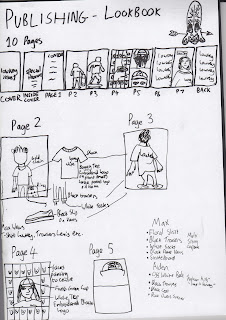
I first decided to sketch out my lookbook plan so I could make adjustments and sketch things out quickly. This is shown below:
After this I created a plan using photoshop which was cleaner and easier to interpret.

Final Lookbook


Evaluation

Overall I think that this project was interesting as well as successful on my part. I enjoyed most parts of the project - particularly the design aspects of it.
Firstly the research part of the project went fairly smoothly and the only part I found hard was thinking of a brand name.

After this I had to come up with the garments. I first made a few logos using photoshop and then applied these to pieces of clothing. This went fairly well however the mockup garments didn't look that realistic and you could tell they were faked on photoshop. If I were to do this again I'd put more time and research into making this look better.

Next we had to do our photoshoots. I did half of my photoshoot outside of college time with a few friends and the rest of it in lesson. The photos came out okay but some of the lighting was off. Luckily I chose to shoot my photos in a raw format so I could go on to edit them properly. After editing I was happy with the images.

Next I compiled the lookbook using photoshop which was not too bad, however it took a while cutting out certain objects etc. I was pleased with the end result, which followed a retro style. I put all of the pages (saved as pdf) into InDesign and printed them off onto A3 (folded to make an A4 magazine). I would've liked a bit more time for this part of the project as I had to rush the printing, resulting in me having to print the magazine off 2 times before it was how I wanted. The print was overall good but it looked a bit dull and I would've liked to print it on higher quality paper.

I am pleased with the finished product and I think it looks professional and follows the brief effectively. If I were to do this again I would've taken less time on the digital side of things and spent more timing considering the print aspect of the project (layout, paper, printer, size). Nevertheless I enjoyed making the lookbook and will consider doing something similar for my FMP.