Test shooting in the plane cabin made us aware that it's quite tight for space, meaning we need to be decisive with what kit we use in there and how we shoot it. We have lots of creative control lighting the scene as external light can be blocked out although we need to make sure we're effective with how many lights we bring in and use. A plus-side of the small space is that through the lens it's easy to make the cabin look busy and therefore more realistic. This also means we don't have to try and fill up the whole area with actors and on the day of the shoot it should be simple to organise them. On the flipside it can also be made to look larger than the area actually is - with these two effects we can play around with them to give a dream-like atmosphere.
Click this link to see a short cut of some shots we got in the cabin.
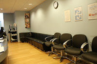
Another area we investigated was the salon in Bath College. We figured the reception here could be repurposed into a dentists reception for the short film. As shown by the photos it's a very large space and looks dull and bleak due to the empty walls. We wanted the location to be boring and mirror the character so this is perfect for the reception location. The empty walls also mean we can add relevant posters if needed.
The location looks industry standard for a reception and having this level of realism will be effective in making the short film look professional. One issue that we face however is the branding on the wall. This could either be removed in post production (which isn't ideal as ideally we'd like as little work as possible during post) or we could try to get shots which avoid showing this. Lastly, the wide space is successful in making the character look alone and isolated (as shown in the photo on the right). This helps to convey underlying feelings the character may be experiencing and atmospheres to the audience.


No comments:
Post a Comment