In Ed's moving image lesson recently we have worked on shooting actors having a conversation from a script provided by Ed. Through this we have discovered how to do this effectively. There's three main stages of this: writing, shooting and editing. To practice this we shot and lit a scene in the studio, and cut it together. We also were given access to the original footage of the scene and cut that together too.
When planning out a story to shoot, the pre-production is one of the most important stages. A significant part of the pre-production is the characters and script - dialogue drives and develops the plot the most. At this point of planning, the idea of the characters in your head and their relationships are fairly vague. Writing dialogue is a struggle and can take lots of revisions and changes. One thing to consider when writing is how the actor will deliver the line - Will they be feeling a certain emotion? What speed will they say it? What expression will they have? - this needs to be listed in the script as a parenthetical remark. All of these things become a bit clearer when shooting.
At this stage of production you work with the actors and can see the characters develop their personalities and relationships, as there is a real person to represent them. During conversations you can present the characters through their reactions, emotions and delivery of dialogue which can be done by directing the actors. As there are many takes, you can observe how the actors act and in-between takes speak to them about what you want them to change or do.
Finally, in the edit you have the ability to pick and choose how much of a certain emotion or reaction to show, and what order the shots are in. During editing you need to not only consider showing the characters when they react and speak, but also think about the flow of the scene and make sure it doesn't seem mechanical. If done well this can achieve different atmospheres/emotions or build tension etc. making a gripping and intriguing film for the viewer. Getting the intimacy right between the audience and characters can be essential. This can go on to invoke an emotional connection from the viewers.
To put it simply; a research project is a large piece of formal, detailed writing, with images and external sources that explores an idea or subject. It is usually done to increase ones knowledge on something and give them the ability to learn more. As put forward by Successful Writing "A research paper presents an original thesis, or purpose statement, about a topic and develops that thesis with information gathered from a variety of sources."
Potential content in a research project is similar to a book, in that there's a front cover followed by a bulk of writing. Content may include primary and secondary research, statistics to back up points, images on occasion and lastly extracts from past publications, data from documentaries and films. Throughout the research project the writing should be of a formal, detailed standard and use Harvard referencing. This means that references must be listed in a research journal/bibliography in a Harvard Referencing format (Author, Year of Publication, Title, Place of Publication, Publisher) for books.
After completing these three mind maps, I decided that I wanted to base my research project on 35mm film photography. I had created two mind maps with a similar topic: ("Why is film used today and is it still a valid medium" & "Why has film photography become more popular in recent years"). Out of these I have decided to focus on why film has become more popular recently. This is because I can relate it the the modern day photography industry and look into statistics. Furthermore looking into film photography will be an exciting project for me as it is a medium I find aesthetically pleasing and interesting as it's so aged.
Using Harvard referencing in a research project (if not in all work) is essential to ensuring your work is professional and of high quality. For example, using Harvard referencing helps to avoids plagiarism by letting the reader know where certain data is sourced from and who created it (the author). In order to properly reference a piece of writing for example, it needs to be included with an in text citation and a full reference in your bibliography (or reference list). This form of referencing is also helpful as you can include data using it to back up research you're conducting to make a more impactful point. Furthermore it lets the reader know that you've committed to your research and explored different books, websites, magazines etc.
When referencing a book for example, the reference would look like this:
Bell, J. (2010) Doing Your Research Project.
5th ed. Maidenhead: Open University Press.
The authors surname followed by their initials: "Bell, J.", the year of publication in brackets "(2010)", the title in italics with the edition if it applies "Doing Your Research Project. 5th ed" and lastly the place of publication and publisher "Maidenhead: Open University Press.". This covers all relevant information to not only show exactly where you've sourced the data, but also to let the reader find the data for themselves.
Interviewing someone from the industry gave me a great perspective of media and the real life practical aspects of it. From completing this task I learnt 3 main things. Firstly, I discovered that I should keep doing things related to media, be it watching films, taking photos, writing scripts or experimenting. The second thing I learnt was that any work in the industry is good work, even if unpaid. It enables you to make contacts and connections which is vital and can help towards you getting noticed. Lastly I found that I should try to make a portfolio and show myself off. This means that when people ask or find out about you, you have something to say for yourself.
Strengths
-Had a minimalistic layout - didn't look too complicated
- Was organised into sections and neat looking
-Shows a variety of photography types, letting viewers know my range of skills
Areas for Improvement
-Content limit - more photos could have been added
-Not much information, add text for details
-No contact information or details about me
3 Things I've learnt by completing these tasks
-Important to get yourself out there online
-It can prove quite challenging to make your own website
-Constantly keep creating content
Presentation
Strengths
-It was to the point and concise
-Arranged in an easy to understand manner
-Good choice of goals
Areas for Improvement
-Too simplistic - add photos maybe?
-Short length, add more information/goals? Go into more depth
-Present it better - use gestures, face the audience etc
3 Things I've learnt by completing these tasks
-Work hard to get into uni - the sooner the better
-Do independent research/work outside of college
-Contribute/go the extra mile in lessons
For my 12 month development action plan I've split the plan into three main goals and gone into detail of each goal, listing details of the goal and how I can achieve it in a specific timeframe. My first goal and most important goal to me is to get into University to do a course in either film or photography.
To do this I'll need to work on a personal statement and have this complete, ready to send off before the 15th January (which is the deadline for applications). I'd like to have my personal statement complete on the 15th November so that I can apply to Universities sooner rather than later. This seems like quite a daunting task so to get this done I'll need to set out a plan for each paragraph of the personal statement, brainstorm ideas of what to say & do research online by watching videos and reading articles and other personal statements. I'll also need to ask for feedback from my lecturers and adults so I can keep adapting and improving the personal statement.
Next I'll need to find some University courses that apply to me so I can apply to them and have good options (if I get a place). I have some universities in mind already but I'd like to find a couple more and ideally I'd like to have this done by the end of the month, so to make a sound decision of courses I need to read their prospectuses and look at their websites which will state what they look for in a student.
Lastly I'll need to take action on what the university websites say about ideal students and make myself appealing to the university by acting on this. This will mean working to my best ability in this college course to try and get a distinction, and working on personal projects outside of college. I'd like to make at least one product a month up until University so I gain lots of experience and knowledge whilst also having some work to show for myself. This product could be something moving image based, audio based, or photography and design based. I'd also like to try and watch at least 3 films a week to get more familiar with analysing and understanding them, and again to gain experience.
My second goal is to improve in my college course so I can achieve the best grade possible, which will help to lead me on into higher education. I've split this section up into the three lessons we're taking this year: Contextual Studies, Moving Image and Audio. To begin with, for Contextual Studies I'd like to learn how to pitch better, which means delivering my ideas and presenting more effectively. This is because pitching is an important skill to have in the media industry and can help massively towards getting your ideas heard. To do this I'll need to research effective techniques online and practice pitching in these lessons.
Something I'd like to improve on in Moving Image lessons is knowledge on real life aspects of film and tv such as budgeting a production, lighting techniques, scriptwriting and storyboarding. I know how to do all of these things but I'd like to research them in more detail and learn how to do them better so I can improve my work. I'll be able to research all of these things online so I aim to be more skilled in all of these things by the end of the year.
For audio I want to become more familiar with sound in premiere so that I can apply this knowledge to my video productions. To do this I need to pay full attention and contribute in my audio lessons with Tom, as well as doing research and experimentation outside of college by watching videos on it and googling it.
My last main goal is for personal things outside of college. For these I'd like to make myself more attractive to future clients and employers which means making a portfolio and personal website. Which I aim to have completed by the start of 2018. I also need to work on independent projects outside of college with other creative individuals which I will do on my free days and in the holidays. Lastly I need to keep myself organised so I can work to my best ability. I can do this by setting deadlines and achievable tasks for myself.
I hope to check back on this blog monthly so I can see what I'm doing and what needs to be done, leading to my personal development.
In this lesson we experimented with different lenses and apertures to see how they affected the depth of field. As the aperture increases numerically the depth of field gets deeper. This video shows the different apertures + lenses I tested:
I concluded from this that a small aperture like f1.8 makes the background very blurred and soft, bringing focus to the foreground. (Professional look also) This looks better for portraits in my opinion. With a large aperture like f22 the background and foreground are both in focus so this should be better for location photography or trying to get a shot where everything is focuses on. Additionally, with the zoom lens fully zoomed in you need to bring the camera quite far back to get the subject in frame, which can be an issue. Another thing I noticed was that the perspective changes with lenses.
For the research of Enter the Pitch we needed to come up with a film idea which is based off the Bible. I'm not a Christian so I didn't have a lot of knowledge on Bible stories, however I have seen a few Biblical themed films such as 'Jesus Christ Superstar' and 'Joseph and the Technicolour Dreamcoat' so I had some knowledge.
To begin with, I brainstormed about what kind of film I wanted to make and thought of some of my favourite films, which let me to 'Goodfellas'. From this I decided I wanted to make a Gangster film. This is because in Gangster films I find the stories are gripping and I like the style and tension in these films. I looked at some clips from gangster films for inspiration and found a clip from 'Goodfellas II' where somebody is given the Kiss of Death:
I then remembered the part in the Bible where Judas betrays Jesus with a kiss as this is shown in the film 'Jesus Christ Superstar' and thought that these 2 things can be linked. This is because the kiss of death is a kiss of betrayal in the mafia, similar to how Judas' kiss betrays Jesus. For further research I looked at wikipedia pages of both of these subjects: https://en.wikipedia.org/wiki/Kiss_of_Judas https://en.wikipedia.org/wiki/Kiss_of_death_(mafia)
After this research I was able to come up with some good ideas for me to start planning out my film. To help me with this I made a moodboard to get some ideas and themes down such as similar films, styles, and time periods.
For this module we had to work on our own film ideas for the competition "Enter the Pitch". To do this we had to come up with a film idea based off a Bible story and create a treatment and pitch for it. Once we had completed a treatment we had to pitch our film ideas. Below is my pitch which I will reflect on in order to improve my pitching skills for next time.
Overall I think I pitched my idea fairly effectively as I got the idea across in time and went through everything I wanted to. When watching my pitch back on video one main thing that stood out to me was my use of "uh's and like". This makes my pitch seem more unprofessional and not as concise which I'd like to try and improve on next time to clean up my pitch technique. Another thing I noticed I could improve on is my speed as I speak quite quickly. This can partly be justified as we had a 2 minute time limit but I think this is also something I can try to work on.
I also thought that to improve my pitching technique I could try and maintain better eye contact when pitching as this shows I'm more confident and that I have memorised my ideas (because I'm not looking at the notes as much). Furthermore, I thought that the use of hand gestures would make my pitching more effective. By using gestures I can get the idea across better and won't look as static.
In Conclusion, I think that I need to try and act more confidently when pitching and try to be more logical in my thinking and slow down when speaking. This will make my pitching a lot more professional looking and effective.
Below is the logo I've created for a company I'd like to pioneer in the future; "Forget the Youth". At this point it's just the name of a magazine I create/produce and distribute independently that features my photography. In the future I'd like to start a clothing line under the same name and produce videos as the company, be it skate videos, commissioned music videos for artists or freelance random videos, not to mention becoming a well known youth culture magazine similar to 'Dazed' or 'iD'.
Representation
I chose the name 'Forget the Youth' mainly because I find the name ironic/satirical. This is as lots of adults and businesses are constantly trying to appeal to young people and fit in with youth culture but overlook this and don't achieve it very well.
Furthermore, lots of individuals forget that young people are going to grow up into adults and become the new modern society (Young people are our future etc etc..) and the planet which they are going to live in becomes impacted terribly due to the past societies actions (House pricing, pollution, the education system, economy and brexit to name a few).
Additionally the company will focus on youth culture topics such as fashion/style, music, skateboarding, filmmaking/photography, art and more.
To conclude, I guess that the brand name can be interpreted in a range of ways, and the audience may interpret it how they please.
Design Choices
Looking at the design aspect of the logo, I chose the bold font paired with a stroke (outline) and shadow to give it a vintage and retro feel, as I felt this design choice is the most aesthetically pleasing and appealing to my target audience (12-24 year olds) whilst looking professional enough for potential clients. I chose the colours dark red and gold because they're bold and compliment each other well, making the logo stand out but also look visually enticing.
A 'MacGuffin' is a plot device which acts as a goal or motivating object/person in a film. Sometimes it can be the most vital part of a film's storyline but it is the effect of the McGuffin on the characters and motivation which is what makes it important. It leads a film from one part to the next and helps the story keep moving.
Commonly the MacGuffin is focused on in a film in the first act, and after this becomes less important. A lot of the time they reappear towards the end of the film (or in the third act) and help the problems which have arisen in the film become resolved.
Example
For example in "The Shawshank Redemption" the central MacGuffin could be seen as the pick. This is because early on in the film it's introduced and helps Andy and Red become familiar with one another, developing the characters relationship. Although the pick is prominent throughout the film, it declines in importance because the viewer assumes Andy is just using it to carve small rocks. It regains importance towards the end of the film however when we discover that Andy has actually been using it to escape prison - a big twist on the film which is unexpected and resolves the main issue (Andy's innocent).
Good eye for design - I have a sound knowledge of colour theory and text placement etc, which is effective for the creative aspect of a project. I'm also interested in mise en scene which is helpful when setting up a scene and editing footage.
Analytical in my work - I have the ability to be thorough and analytical with my work so that I can achieve the best grades for research and written work.
Writing skills - With an A in GCSE English I can safely say that my writing is at a high standard that makes my work look professional, clear and easy to read.
Ability to follow brief effectively - When following a brief I make sure to read it in full and check that I have accomplished all tasks listed to achieve the highest mark possible.
Weaknesses
Not asking for feedback on work - When doing my work I get fairly engrossed with it. I also feel self conscious about it and this means that I don't ask my peers or lecturers for feedback, which I will try to change this year. To improve on this, when I have done a first draft for my work I'll ask a lecturer to look at it and give me some feedback. Hopefully it will help me view my work from another perspective so I can improve it further.
Leaving work to the last minute - A lot of the time I'm not motivated to do the work set which means I leave it to the last minute and have to rush it so I can't put as much effort into it as I like to. This can be improved by me creating a schedule so I know the due dates for all of the different production targets, and becoming more organised so I have a motivated mindset allowing me to do the work. After the October half term I'll put a schedule into action so for the next set of work I'll have a clear understanding of deadlines. This leads me on to my last point:
Bad organisation - With Google Drive and files on my computer I allow things to get very jumbled and disorganised which can lead towards me losing work or making it harder to complete work. This can be solved by me allocating some time in the half term to tidy up files on my laptop and google drive making everything more clear and organised.
Opportunities
Work experience - In the summer holiday I had a weeks work experience with the crew of Doc Martin filming for ITV. This helped me gain a lot of knowledge on what its like working in the industry and was a great opportunity.
Client/Industry placements - During this year of college we will be given client work and maybe industry placements which will be a helpful opportunity for me.
Access to equipment - The cameras and other new equipment at college mean that I can produce an excellent standard of work effectively.
Out of school projects - The hobbies I have outside of college like my YouTube channel and Independent magazine business are a big help in giving me opportunities in the media field.
Threats
Distraction from work/Time management - When doing work I'm easily distracted by social media and other distractions so I hope to cut down on this. One way this could be achieved is by giving myself a set time to do work with small 5 minute breaks in between. This way I would be less distracted and allow myself to focus on doing the work.
Only doing bare minimum of work - Sometimes I find myself only doing the bare minimum of work so I need to try and make an effort to go the extra mile. This links back to my weaknesses of me not being motivated enough so to solve this problem I will have to again try not to rush the work (leave myself a good amount of time to complete it) and make sure that everything is organised well.
Lack of motivation - I find it hard to be motivated to do work sometimes. In order to solve this I'm going to try getting motivated by watching videos or setting myself achievable targets to do with the work, as a lot of the time I'm not motivated because there seems so much to do.
For the final major project of Year 1 Media we had to come up with our own ideas for a project in the area of media of our choice. I wanted to incorporate moving image, publishing and design into one project so I chose to make a photography and graphic based magazine - focused on creative young people - and a video advertisement to go alongside the magazine. I chose this pathway because I always enjoyed using photoshop and shooting/editing videos in lessons over my past year of study at college. I also have a passion for youth culture and creating things (being a 'YouTuber' and musician myself) so I thought that creating something like this would be ideal for me.
I was very pleased with my final design, and I felt that it stayed true to how I wanted it to end up when I first listed it in my Statement of Intent and Project Proposal. If I were to name its strengths, I'd say that the magazine and advert together had a consistent style throughout, giving the project identity and making it seem neat and professional. The magazine also had some really brilliant content giving an intriguing insight into some of the work and creativity that goes on in young peoples brains. The advertisement I thought had a very attention catching style to it and I thought that this made it effective as a piece of work to promote the magazine. I also thought that the final magazine worked well as a product, which I was reassured by from my survey results, with 100% of the participants claiming they'd consider purchasing it. Lastly, I think that it followed a consistent colour scheme which made the magazine match the retro style and look visually appealing.
As for weaknesses in my final production, there are a fair few mistakes which could be improved on if I decided to further develop this idea and make it a real product for people to buy. Firstly, the magazine is only 24 pages long (including the cover pages) which is fairly short for a magazine. If this were to be a product available to buy I don't think consumers would see much value for money in it. If given a longer time to produce the magazine I think I could really prosper in making it have a lot more depth and content. Another weakness in the product would be small errors in the magazine such as spelling and grammar mistakes which can be seen in the printed version. The changes are made in the digital version however to improve on this I would have made sure to get a lot of feedback or even just a proof read of the magazine to ensure it was of high quality before sending it off to print. As for the weaknesses of the advertisement I thought that it could have included a bit more information about the magazine which it is trying to sell, as I focused more on the visual aspects of it as opposed to the commercial aspects. This was made clear to me by the results of my survey of the advert.
The main idea for my theme was to make a magazine about creative young people and make sure that it looked visually appealing and had a retro, 80's/90's style throughout. As for the advert I wanted to effectively promote the magazine whilst at the same time make a stylish video which was timed to music and followed the same theme as my magazine. A main influence for the design and layout of my magazine would be "iD Magazine" & "Dazed" as both of these magazines take inspiration and replicate retro themes and styles in their publications, as well as focus on topics similar to those I wanted to focus on. I looked at these magazines during my research which helped me shape my magazine. I think I stuck to this theme well throughout the project.
When doing research & experimentation for my project I explored different design & layout techniques, camera settings, cameras and video editing techniques which helped me gain a better understanding of all of these things. It also inspired to me to shoot some film photos for my magazine which supported the old school style. Exploring camera settings also meant that when shooting the advert and photos on a DSLR I had a full understanding of how it worked and could adjust it to make it look exactly how I wanted. Lastly, looking at different video editing techniques and comparing an old camera to a superimposed old camera effect helped me shape how my whole advertisement looked and led towards me getting an authentic 80's style ad.
If I were to compare my magazine to iD magazine, the main difference would be the length of the two as iD magazine is a commercial product and has many people working on it as opposed to one. This obviously makes it have more content. Also my magazine focuses a lot more on unique layouts and design features and is a lot more colourful than iD, which is fairly monochrome based a lot of the time. The similarities would be the quirky styles they both follow, the retro design schemes and the focus on fashion, photography and music. If I started up 'Carpe Noctem' as a real magazine and a brand I think that it would work effectively in the market alongside magazines like 'iD'.
I developed most in this project when experimenting in post production in the programs Photoshop and Premiere Pro. In these programs I was able to mess around with many different layouts, fonts and colours to see how things looked when certain things were added, taken away or altered. Premiere Pro allowed me to really go mad with the advertisement and add various effects to the clips I shot to achieve the exact style I wanted.
When I shared this project with my peers I was proud to show them what I had created and I wanted to hear what they had to say about it - both good and bad things. I liked the fact that they could have a physical thing to hold and look through (the magazine) and I think that most of my peers really enjoyed it as it's aimed at that age group. I also liked showing the magazine to peers and was happy to hear their feedback on it and gain their approval of it. Their feedback helped me develop the project further and add finishing touches.
If I could change something about this project I would make the magazine longer and make sure it had more content. Over a longer period of time to produce it I would be able to do this. By making the magazine longer I would really be able to develop it by adding more topics, photographs and maybe even drawings or cartoons.
Looking back on my statement of intent I'm happy to say that I mostly stuck to it and completed everything that I aimed to do. I changed some of it due to the initial survey I did about what content I should include, which meant cutting out the topic of skateboarding completely from the magazine. The advert stayed pretty much identical to how I described it in my statement of intent and pitch. One thing that developed was the length of the magazine, as I initially only planned it to be 18-20 pages long. Reflecting on my pitch I'd say that my view on the project has cleared up a lot. At first everything was very unorganised in my head but as I continued with the project I had a clearer view of what had to be done and was able to effectively create a final project. It went a lot better than I expected it to and I'm incredibly pleased with the result. Next time the only thing I'd do would be to give myself more time in production in order to make the magazine longer and include more text, topics and photographs.
After completing production, I set out to assess my product. I did this in the form of questionarres and a focus group. Below is the focus group I recorded:
From this I found that my magazine was appealing to the audience I interviewed which were all part of my target demographic (teenagers/young adults). They all liked the style featured and thought that it fitted the retro style I aimed for. Their criticisms were the spelling & grammar, and the fact that there weren't page numbers. (Because of this I went through and changed the grammar in the digital version that can be found on my brief).
Also from this I discovered that the advertisement was effective and the style stayed consistent to match the magazine. The advertisement was effective because most said they would buy it or consider buying it which I thought was good.
Magazine Survey
To get a more in depth insight from a range of ages and genders, I created two surveys to get feedback about the magazine and the advertisement. This is the survey about the magazine:
I sent this survey to the Tempa Media facebook group and my friends & family, receiving a total of 38 responses. The majority of people who took the survey were 24 and under, with only 15% being over 30. This however meant most results I got were from my target demographic.
The first question I asked in this survey was "What was something you liked about this magazine" and most of the responses I gained mentioned either the layout, interviews or photographs.
I was happy with these results as when I started out with this project I described that I wanted to 'encorporate photography & design into one product' and 'speak to creators/find out about what they do' in my Statement of Intent. It was also pleasing to see that people found it creative and inspiring, and gave them opportunity to find out about different artists.
Next I asked "Were the topics it focused on interesting to you?" and the majority of the answers were a yes. Some individuals answered things like "Not sure", "Somewhat" and "Interesting but not very relevant to me", but after reviewing the answers individually it was made apparent that these results were from the older participants. From this I found that this magazine was appealing but only to the target audience. If I wanted to make this magazine more accessible to a wider range of people I could consider changing the content to make it more interesting for all ages.
Another question I asked was "Do you think the ratio of photos to text was appropriate?" and from this I got similar answers which led to to make amendments to the magazine. Again most of the answers were yes's, but a fair few commented on the end pages which featured photography and collages but no text for context, which I didn't realise until getting the survey results. Because of this I added some descriptions to the photographs and collages at the end, which can be seen in the digital version of the magazine of the magazine on my brief.
I also asked if there was anything that could be improved about the magazine. A lot of people commented on the length i.e. make it longer, which I would do if I had more time and went on to make this into a professional brand or product. Another common answer was the simplicity of the title pages for 'Art', 'Music', 'Fashion' etc. and how they could have been made more interesting by including colour or some more design assets.
All 38 individuals who answered this survey said they would consider buying the magazine, which suggested that it does well as a product and contains intriguing content as well as impressive design and photography.
3 out of the 38 individuals (~8%) said they would prefer it as a digital product. The majority said that they would prefer it as print because they like to have a physical thing that they can hold and something to show for the money they've payed, which tells me that if I were to sell this magazine as a product, I should sell print copies rather than digital for it to be successful.
By carrying out this survey I was able to get a wide range of results telling me useful information about my final product which helped my improve some things about it and gain knowledge on how it would do as a real product.
Advertisement Survey
After creating the video advertisement for my magazine, I made a short survey using Google Forms to get a wide range of feedback on it. Below is the survey:
I also sent this survey to the Tempa Media facebook group and my friends & family, this time I only received 17 responses. 3/4 of the people who answered were up to 24 and the rest were 30-50-year-olds. This meant most people answering were part of my target demographic. There was a fairly even balance of male to female too.
After getting the individuals to watch the advertisement I asked some questions about it. The first question asked "What did you like about the advert" and most said the colours and music. In my statement of intent & pitch at the beginning of this project I stated that I'd like the advert to be stylised, retro, have heavy editing and be timed to timed to music and I think it lived up to this. The answers show that the audience thought this too.
When asked what could be improved on the advert the people answering the survey said that it was a bit fast at parts therefore being hard to read, and more information should have been included. If I were to make another advert for the magazine I would make sure that the text lasted on screen a bit longer, however this advertisement isn't actually trying to sell a product as it's just a mock advertisement. It's more of a stylised video to go alongside the magazine and it's theme rather than something trying to sell it.
Another question I asked was if the retro style worked well and all answers claimed they liked it. This is good because I chose the style to be retro for its visually appealing, nostalgic nature as well as its similarity to the magazine theme. This links back to how I first described the advertisement at the beginning of this project and the style has worked very well.
The last question I asked people was "Does the advert make you want to buy the magazine?" and only 60% of people said yes. This shows that if the magazine were a standalone product more people would be inclined to buy it than if it had an advert to go alongside it. I found this interesting and it has made me consider the effectiveness of the advertisement as a sales promoter. Maybe a video promoting the magazine or giving information about the magazine would be more effective than a commercial advertisement.
From assessing my products I was able to get a lot of helpful insight from an audiences perspective as opposed to my own, which has helped me improve it further.
For the production of my Final Media Project I planned to make a short magazine based on youth culture (more specifically music, art & fashion) and a 30 second advertisement to promote it. I aimed to print the magazine so it could be presented as a physical publication rather than digital.
I wanted my magazine and advert to pastiche retro 80's/90's style and design, so I made a moodboard in pre-production to try and show the 'look' I was going for. I aimed to make sure I kept to this style throughout production.
Magazine Development
Front Cover
To start off with my magazine production I referred to the flatplan I made during pre-production and began to create the magazine page by page in Photoshop. For each single page I opened a new document in Photoshop and selected the preset 'International Paper > A5'. For double page spreads I made a document like this but doubled the width.
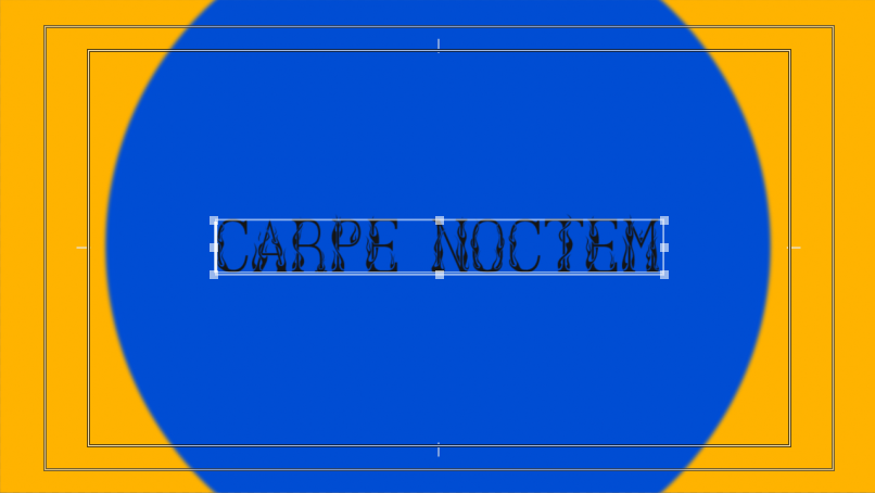
I started with the front page, which I planned to include the title and a photograph. I came up with many different names, and whittled them down to three: 'Creators', 'Carpe Noctem' and 'Youth'. I decided on 'Carpe Noctem' meaning 'seize the night' because I liked the twist on Carpe Diem and thought that it was unique.
After coming up with this name I set out with the front page. At first I wanted it to just be a solid colour with a title:
I tried this with a few different colours and fonts, but thought this looked a bit boring and bland, because there was a lot of dead space. I therefore decided to replace the solid colour with a photograph. I used some photographs I shot on film on a sunny day which had nice colours and retro undertones thanks to the film photography. Through my experimentation with 35mm film I was able to develop my design for this front page and choose fitting images.
I liked the flame font from before as I thought it gave off a real 90's aesthetic, so I stuck with it. After trying a few different photographs I stuck with this one:
I chose this one because the white text looked good against the blue sky and effectively stood out. The photograph makes for an appealing front cover due to the yellow flowers complimenting the deep green tones from the leaves and the light blue sky. The light clouds also match the title colour. My view of the colours was helped by my research on colour theory.
Title Pages
After my primary and secondary research I drew some conclusions as to what I should include my magazine and how it should be laid out. One thing I discovered from my research was the effectiveness of splitting the magazine into sections, giving each different section a title page, similar to iD magazine. I wanted to go for a font similar to the one used on the front page, and also wanted it to be simple. In the end I decided with a black, flame style font on a white background. I liked the font because it looked hand drawn and as if it had something more than just a title. It made it look more interesting. Here are a few examples of the final title pages I made:
One problem I ran into when creating these pages was making sure that the letters all lined up seamlessly so it looked neat and hand drawn. I did this by adjusting the tracking in the character window of photoshop as shown.
Interview Pages
Most of the content in my magazine is interview based. It has four interviews in total and they all follow a similar design pattern as I wanted to magazine to be neat and uniform. I went about doing these interviews by getting in contact with the people and asking if they were willing to be interviewed, then I came up with a list of questions and asked them.
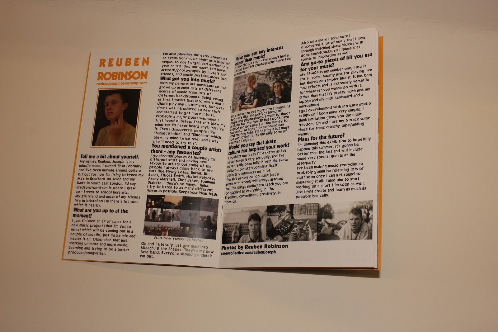
Two of the interviews I did were recorded and typed up (Aiden May and Ben Coleman) and the other two took place in messages online. For Aiden and Ben's interviews I printed out the questions, and recorded me asking them with the answers using a Zoom H4N microphone borrowed from college. I could then listen back to this and type it up into photoshop. For Reuben Robinson and Cale Labbe's interviews, I sent them the questions one by one over email and copied and pasted the responses into photoshop.
As far as design goes for the interviews I used rulers in photoshop to split the page into two, then from this created columns for the text to go in. This made it look neat and uniform. For the type in the interviews I decided to use the same retro looking font throughout to fit in with my theme.
To differentiate the questions from the answers, I made the text of the questions bold. After typing up the interview, I was able to make spaces for images because of the text being bound to a box. I was able to press enter making breaks in the type to make room.
When adding the images to the interview, I made sure they all had around the same colour scheme and that they were related to the interview so that it looked uniform, visually appealing and nothing clashed. As an example I'm using the double page spread interviewing Aiden May. I shot the photographs of Aiden on film in London with him, and took photos showcasing him and his clothing pieces, because the interview focuses on fashion and Aidens involvement in it. I also made sure that when choosing the photos I used the ones with prominent greens, browns and skintones.
From the whole roll of film I chose to use the portrait of him outside the shop as I thought this image was stylish and introduced the subject well. I also chose the photograph of his shoes as these are the pair he mentions just above the image on the page. Lastly I used the photograph of him walking in the tunnel as it had the same colours as the other two photos and fitted nicely over half of the page. It also shows Aiden with shopping bags which I thought was fitting.
Magazine Layout
When compiling the rest of my magazine, I went through some changes to the layout and design to make it fit in with the overall style. One of these things was the layout for Reubens interview.
I thought that it looked a bit bland, so I changed the colour of the title to match his t-shirt colour in the portrait, and added a border of the same colour to the image using the rectangle tool. The border idea was inspired by my research when looking at 'Dazed' magazine, as they used a similar design technique. Below are before and after images of the changes I made to improve the layout:
Another layout change I made was on a double page spread of my photography near the end of the magazine. At first I had one photograph taking up the whole page and another on a white background.
I decided to reduce the size of the full page photo and add a border to both images, which made them match more and look better side by side:
However I still thought this looked a bit bland, so I decided to add a background because I felt this gave the photos context and set a scene. The vivid colours and high saturation of the background made sure that this fitted in with the style.
Final Magazine
After typing everything up and laying out all of the photos and images I had created a full magazine.
I named each page with a number to order them, as before the files were all jumbled and unorganised. By numbering each page it prepared them to be printed into a physical magazine. I also made a .pdf with all of the pages in one file as a digital version and hard copy which I could make amendments to.
Advert Development
When starting the production of my advert I had a fairly clear idea of what I needed to do due to me storyboarding and creating a shot list in advance. I only had 8 things to shoot on camera as the rest of the advertisement would be graphics in the form of titles or animations.
I started off by putting together all of the digital parts of the advertisement according to the storyboard in Premiere Pro. In the storyboard I had planned out all of the colours, titles and transitions I wanted to use in the video. I decided to use the same font from the magazine title in the title of the advert to give the name its identity.
The first shot is animated and has circles which reveal the title. I did this by using keyframes, although it looked fairly artificial at this point.
To solve this, I added some directional blur to the circles to create motion blur, to make the movements look smoother. I also added a small amount of gaussian blur to soften the circles.
The beginning scene ended up looking like this:
Another big part of the advert was the timing to music. I wanted it to flow well and keep the viewers attention and therefore wanted all of the editing to be in time with the song I used. To make sure of this, I zoomed into the audio track in order to see the waveform. This way I could make the cuts and see where they relate to the song.
To shoot the actual video parts of my advert, I set up a greenscreen for the shot of the magazine spinning around. I originally set it up in my room however it was fairly dark and the lights gave off an orange tone. I therefore did it in my sisters room in the daytime as it has large windows which let in lots of natural light. To give the illusion of the magazine floating, I attached a piece of green string to the inside of it so I could hold it up. Below are the pictures of the setup.
I also shot some footage of the magazine being held and read in front of the greenscreen for the advertisement.
At the end of the advert I added a link to the shop online where the viewer would be able to buy the magazine. I thought this was okay but I decided to add a qr code that once scanned takes the viewer straight to the website. This not only adds ease of access but also makes the advert more up to date (which is comedic due to its very not up to date style).
Here are before and after screenshots of the end frame:
This is the first render of the advertisement:
At this point I thought it looked good however I wanted it to have more of a retro style. To solve this I opened it in after effects and applied lots of effects to the video to try and superimpose a vhs style to the video. This included blurring the channels, adding some frame jitter, distortion and a noise and static overlay. After adding these effects the advertisement looked really stylised and I thought it fitted the aesthetics and style well. This is the final render:
Website Development
Finally, I put together a fake website to sell the magazine. I used the company 'bigcartel' for this online shop as they set it up and make it user friendly to create a shop. I stayed with the generic template and adjusted the colour scheme to follow that of the magazine in the sidebar.
I also used photoshop to create a header image, using the magazine title font to keep continuity within the brand. I made sure it had the same colour background as the background colour of the website so that it blended in.
After this I shot some photographs of the magazine to use on the website. I did this in the studio against a large white piece of card to give them a clean, professional looking background. When shooting the photos I shot in RAW format so I could edit the photos non destructively. These are some of the photos I shot:
I used one of the images to show the magazine as a product and the rest of them on the website in a gallery on the homepage.
I thought this looked good however the borders made the photos look dark and unprofessional. To solve this I used photoshop to cut the backgrounds out of the image which made it look a lot more professional and made the design look a lot neater.
After this I thought that the site looked complete and authentic. Here is a link to it.